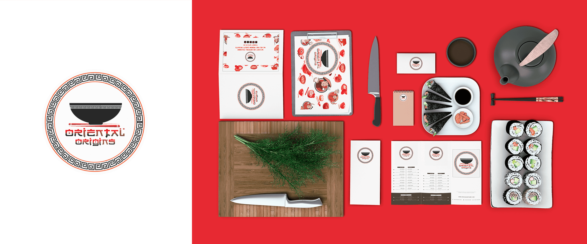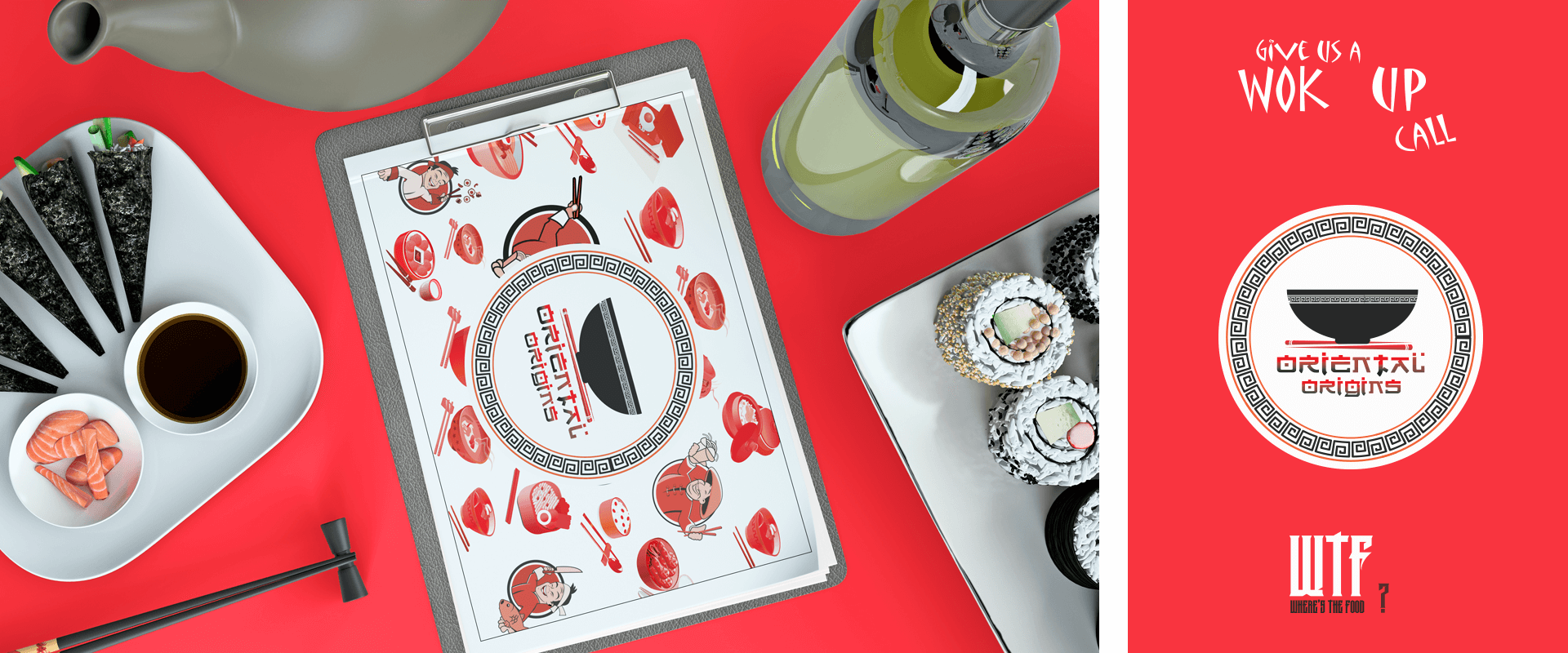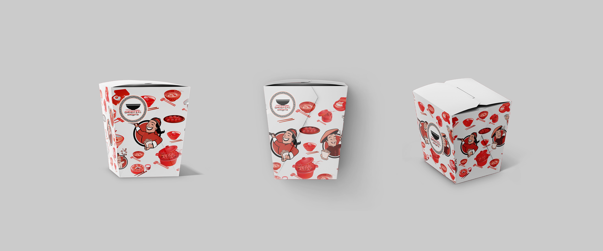
Oriental Origins
We love a bowl of steaming noodles and we couldn’t let go of the opportunity to work with Oriental Origins. Oriental Origins is a Chinese delivery restaurant in Mumbai. They’re known for delivering piping hot soups, Manchurian gravies, chop sueys and more – comfort food at its most delicious. We worked with the restaurant to create a visual identity and to define brand expression across their packaging and collaterals. Oriental Origins isn’t a fine-dine restaurant- it’s about wholesome food and comforting flavours. So, we took the fun route and dosed their branding with humor. The Chinese influence to their logo is probably as apparent as soya sauce is to their menu. We paired simple silhouettes with iconic patterns and fonts. For their menu, packaging and other collaterals, we added animated character illustrations and witty quotes.