Quba
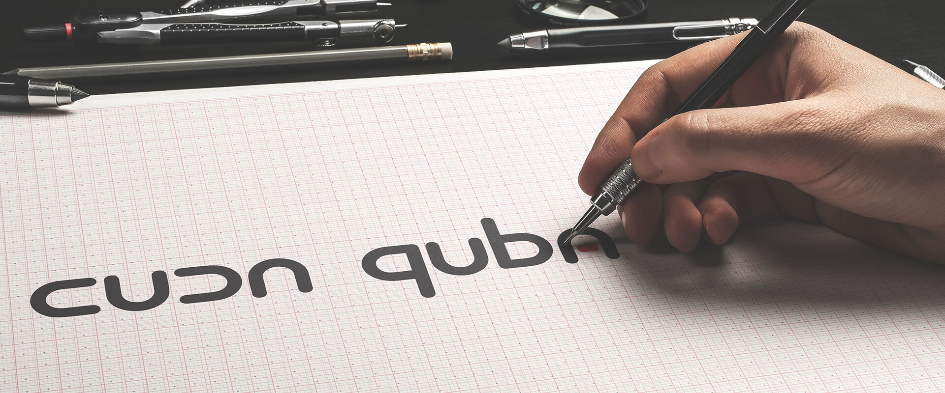
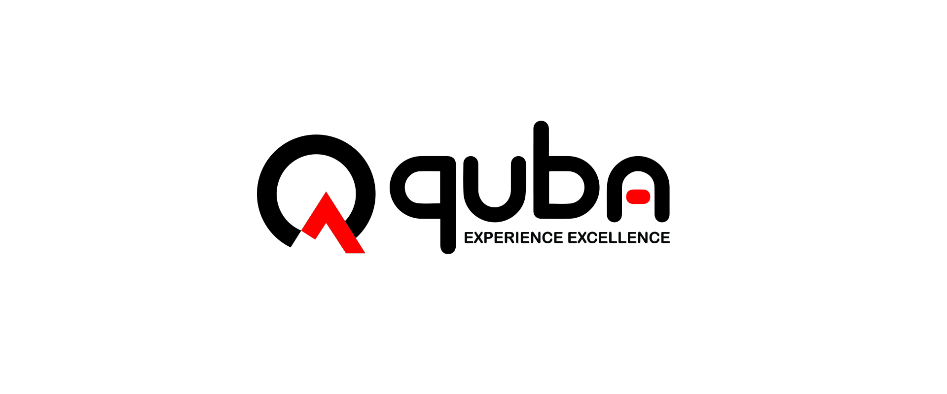
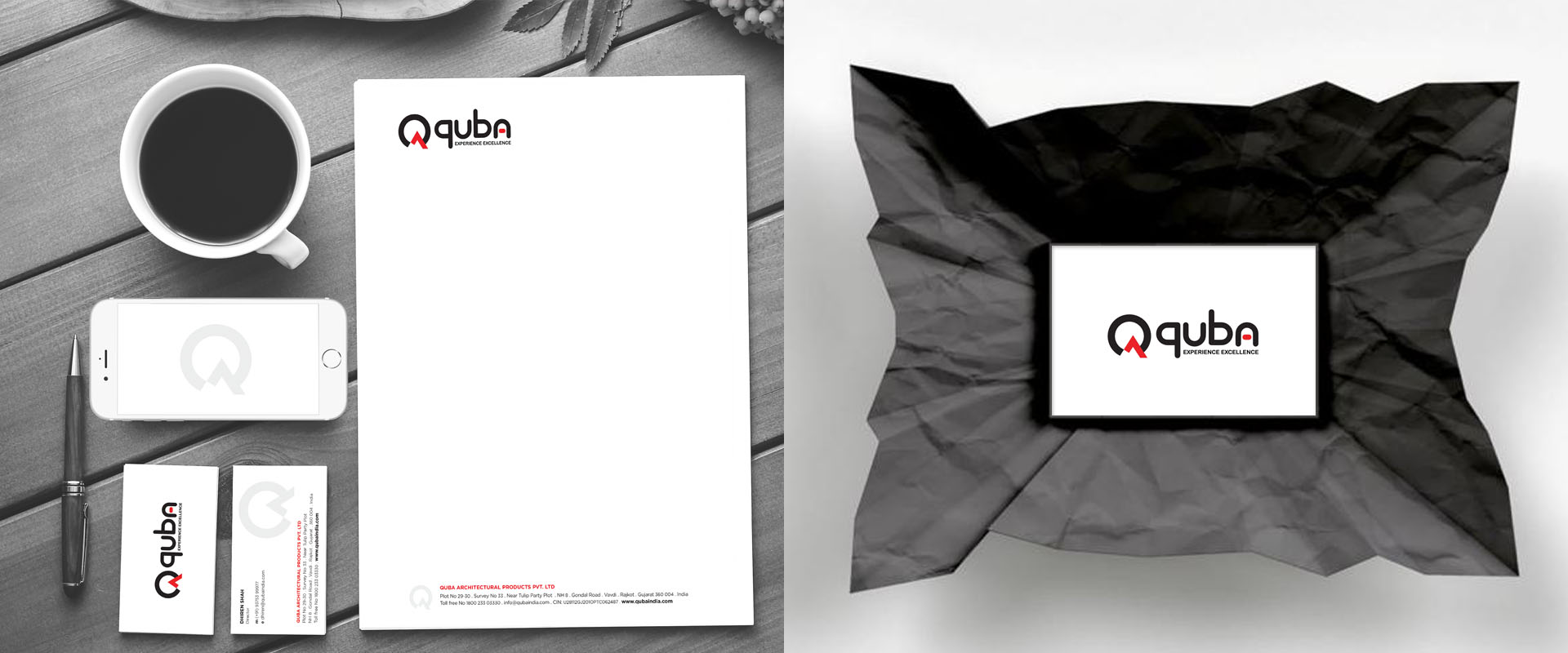
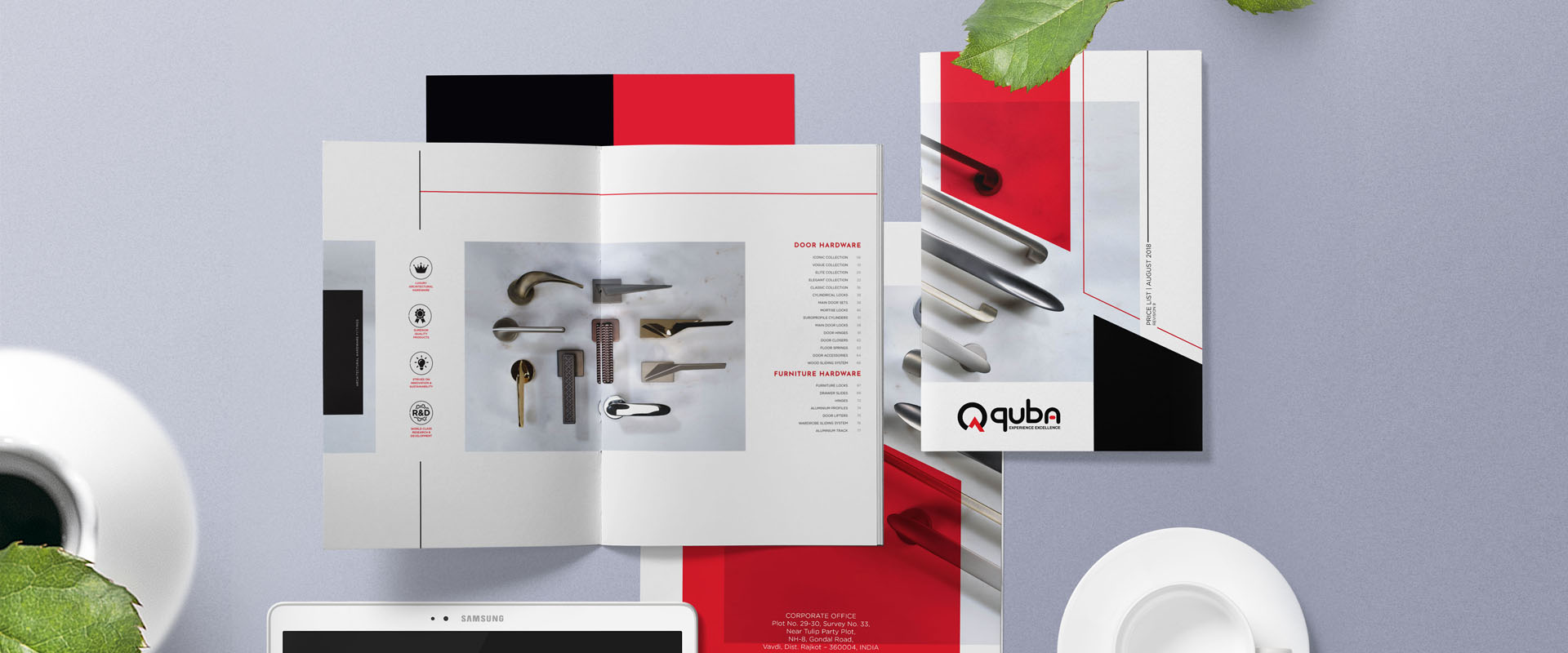
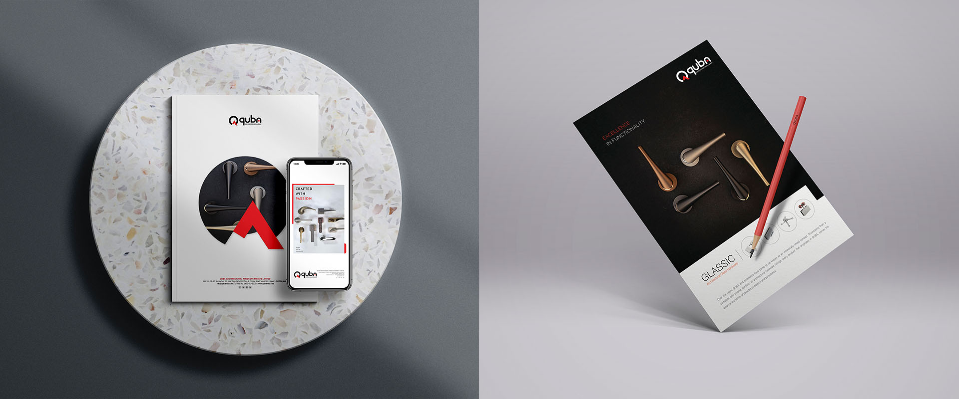
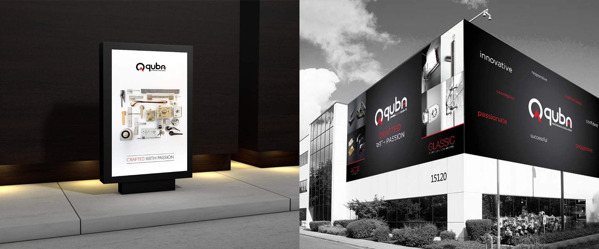
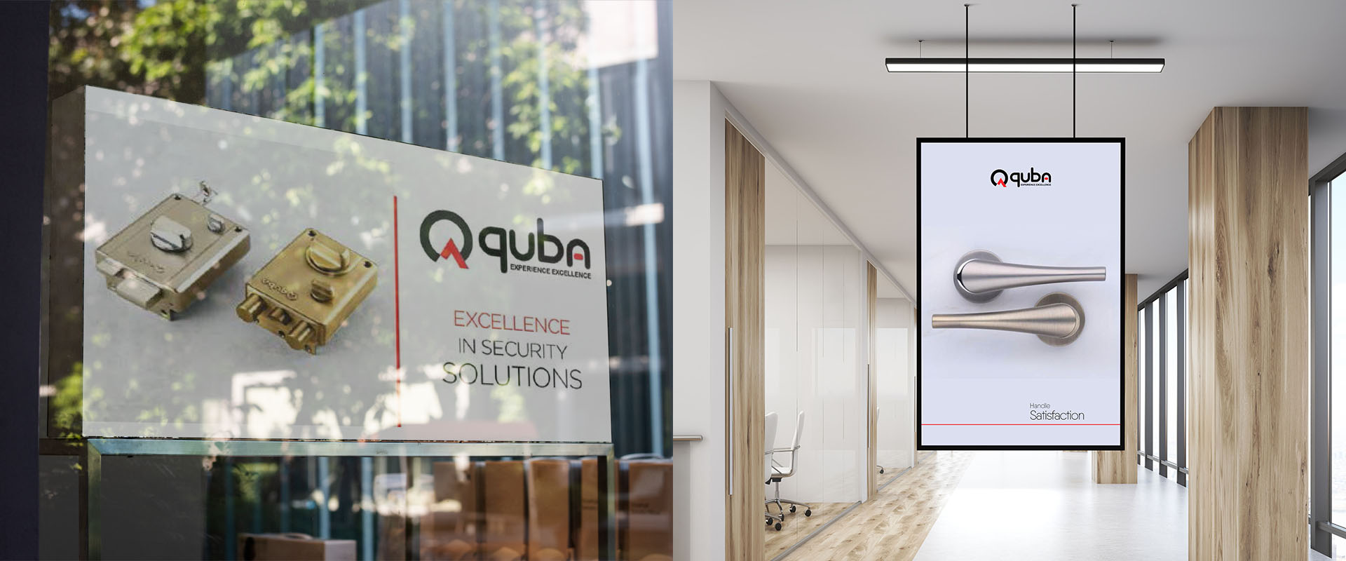
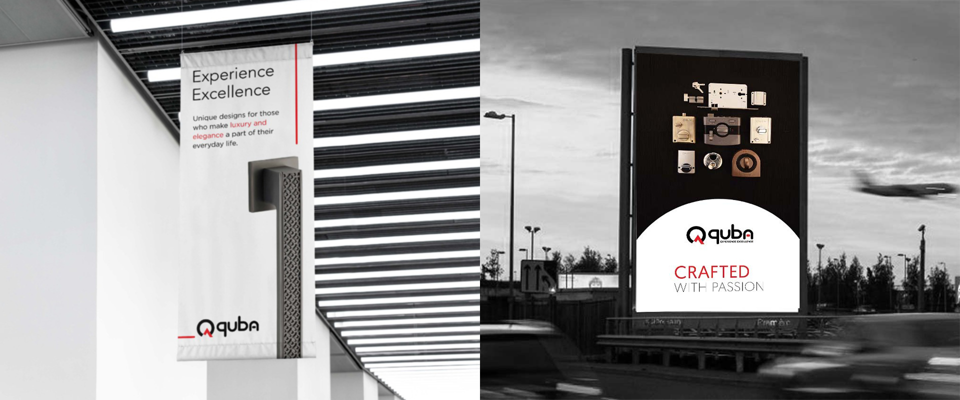
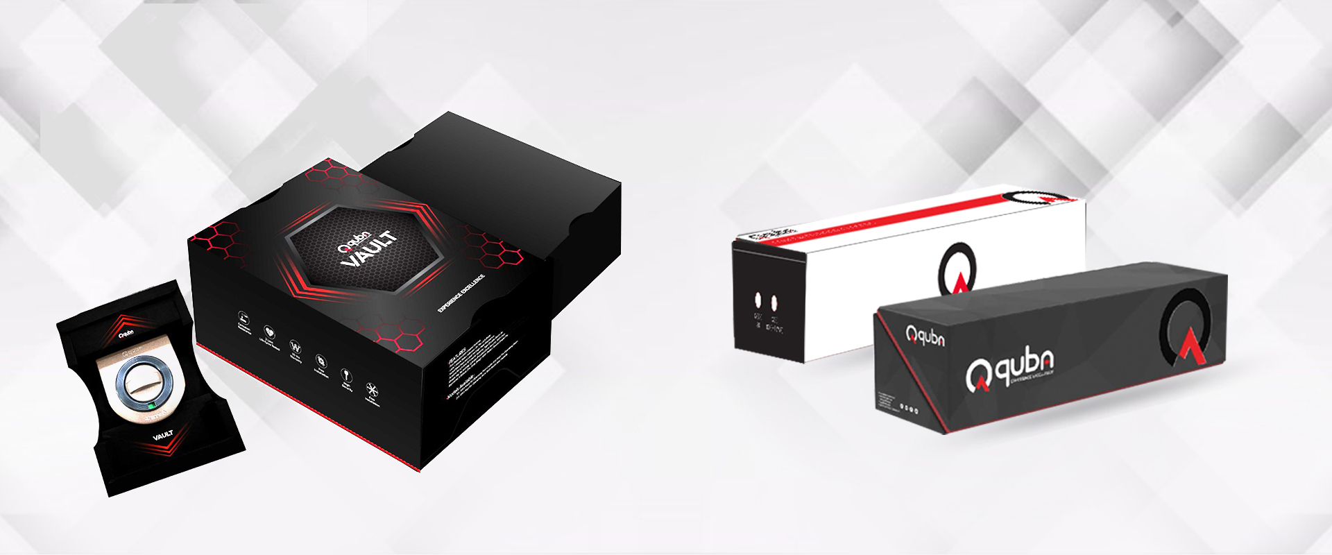
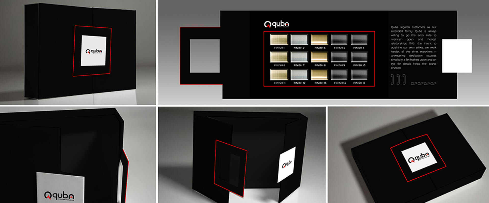
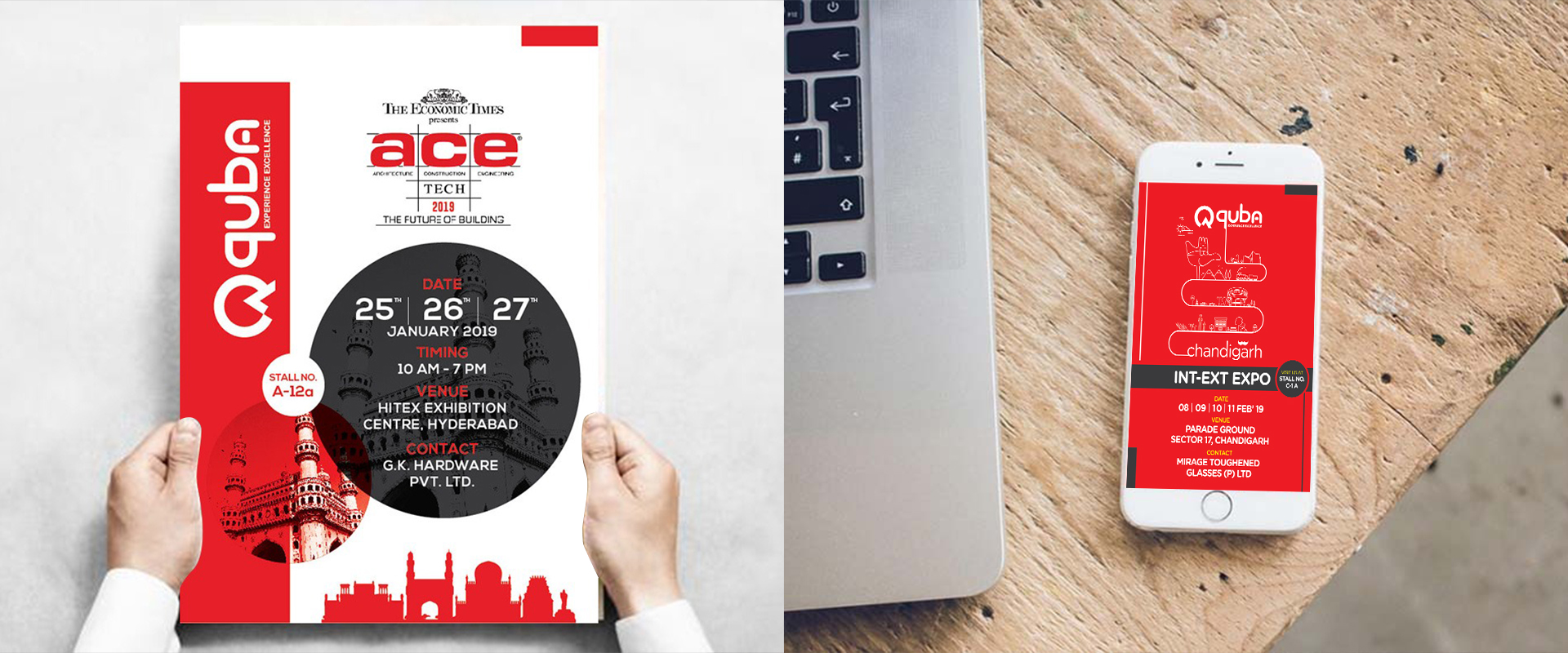
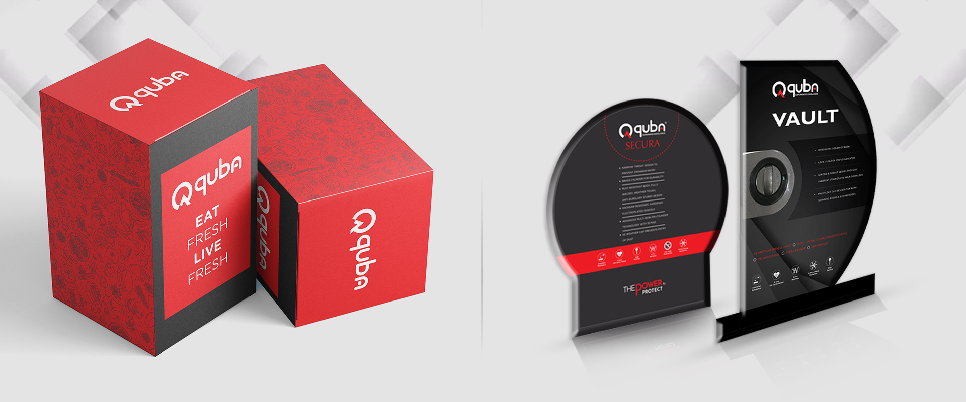
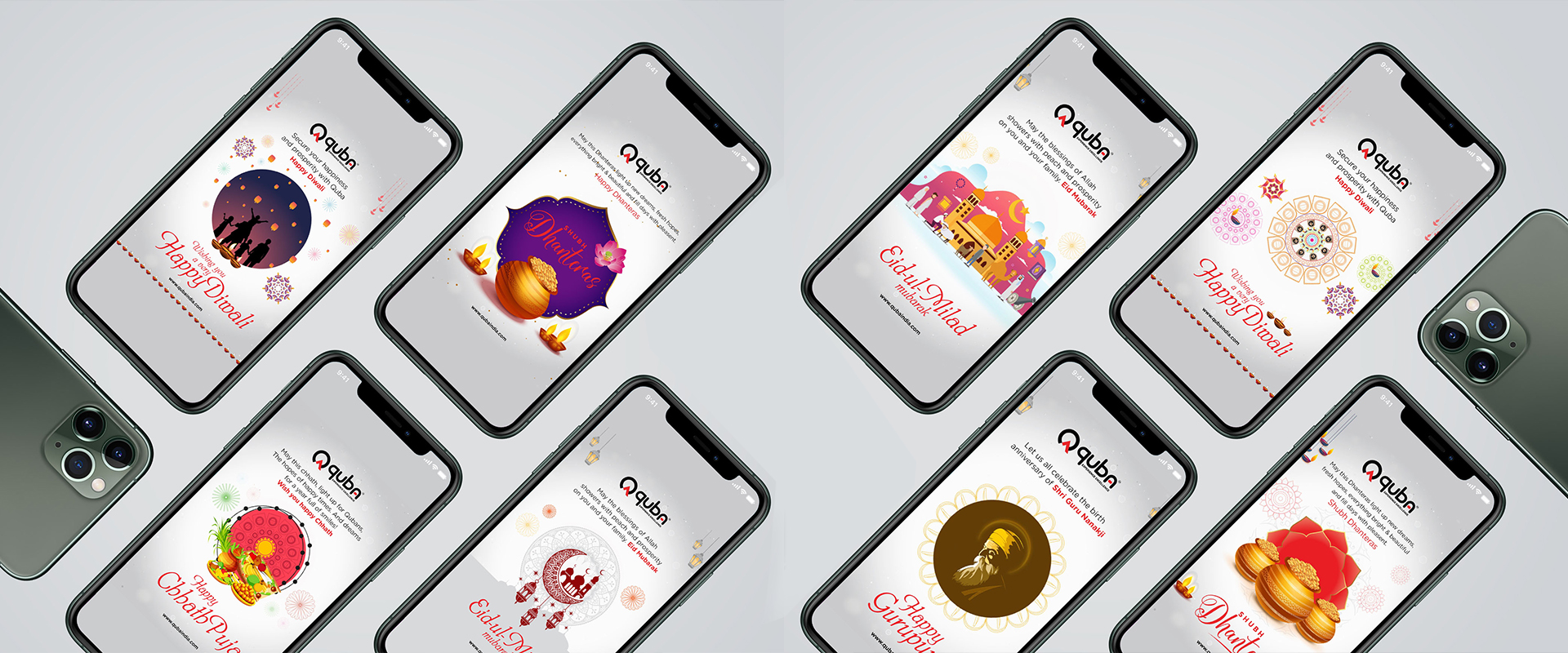
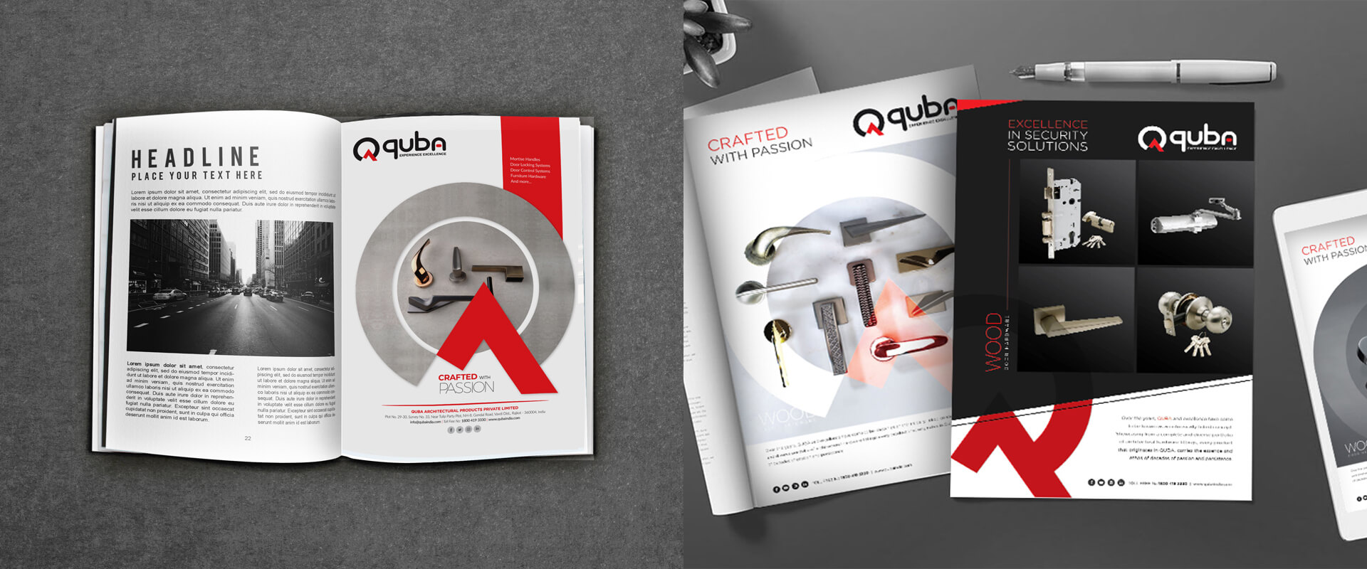
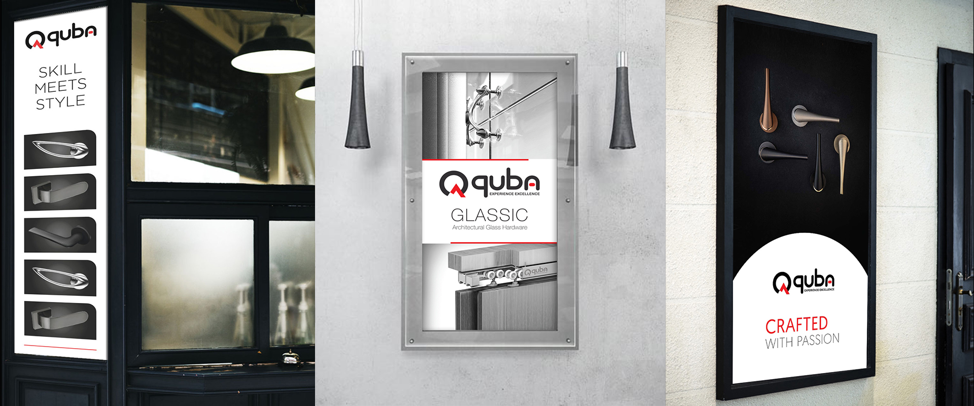
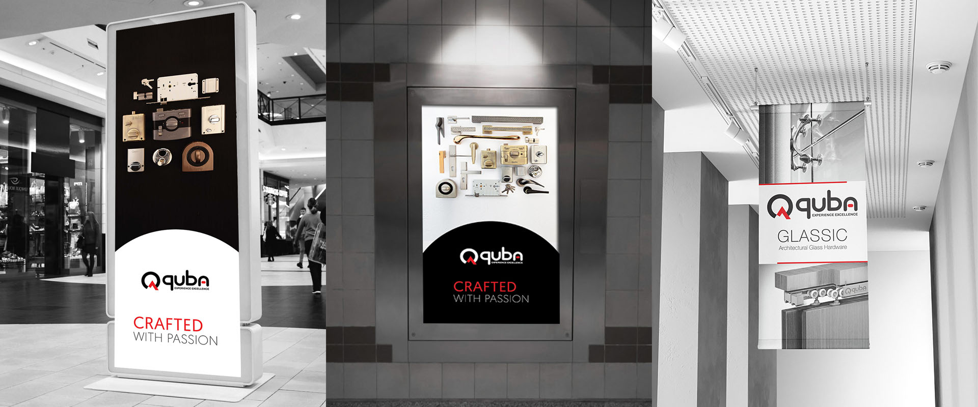
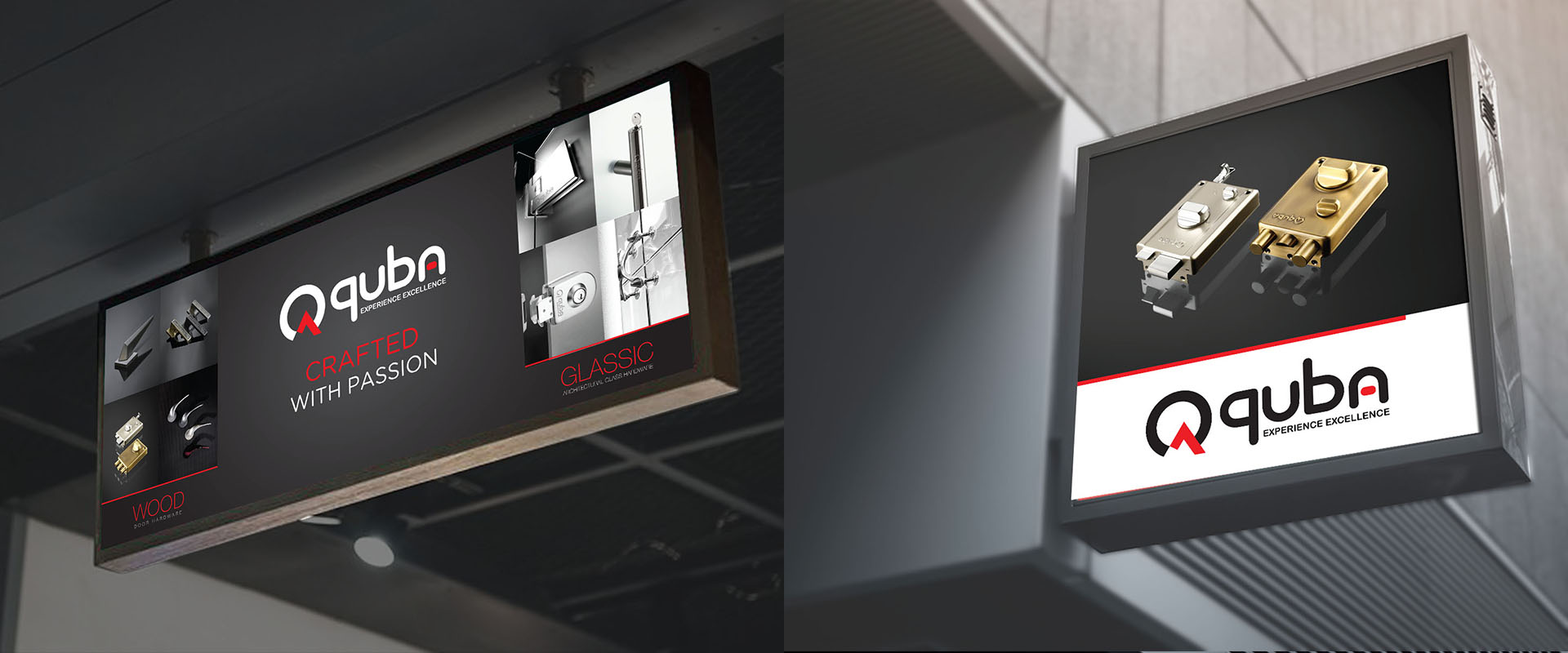
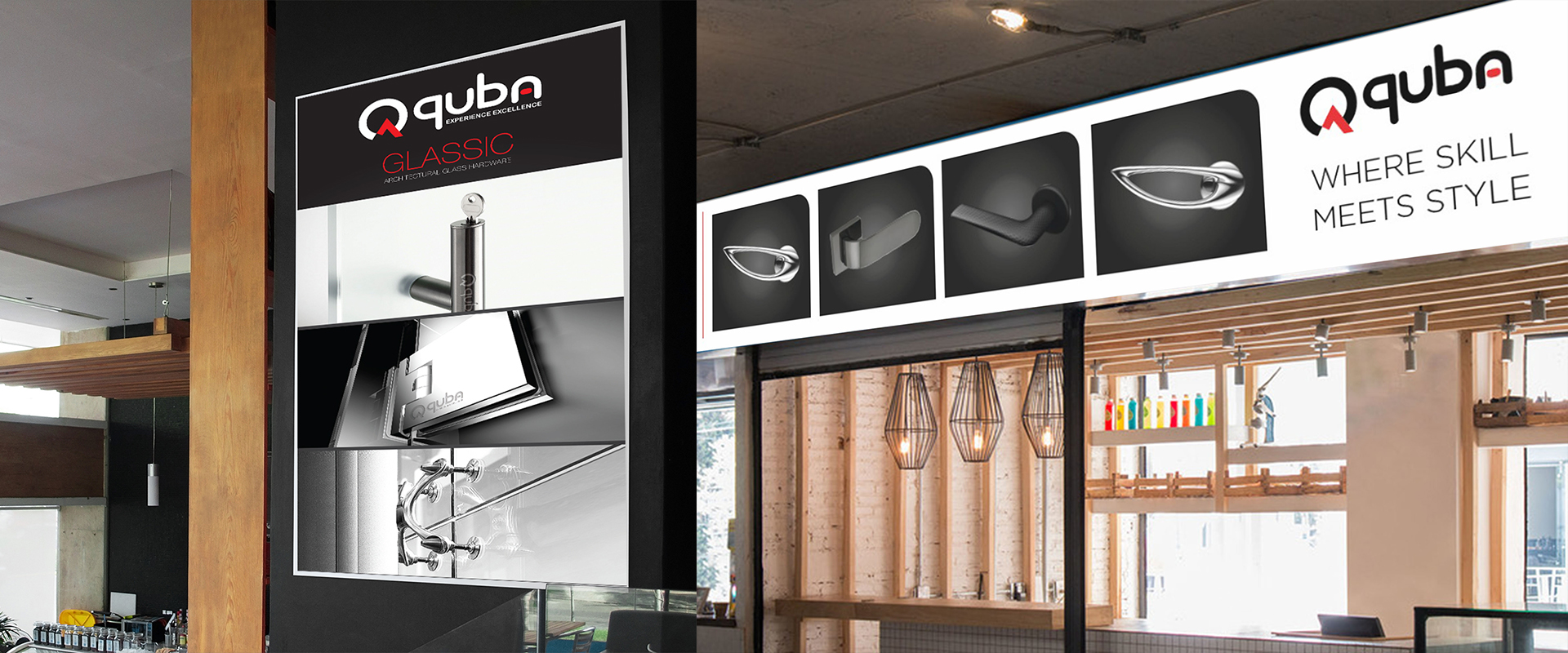
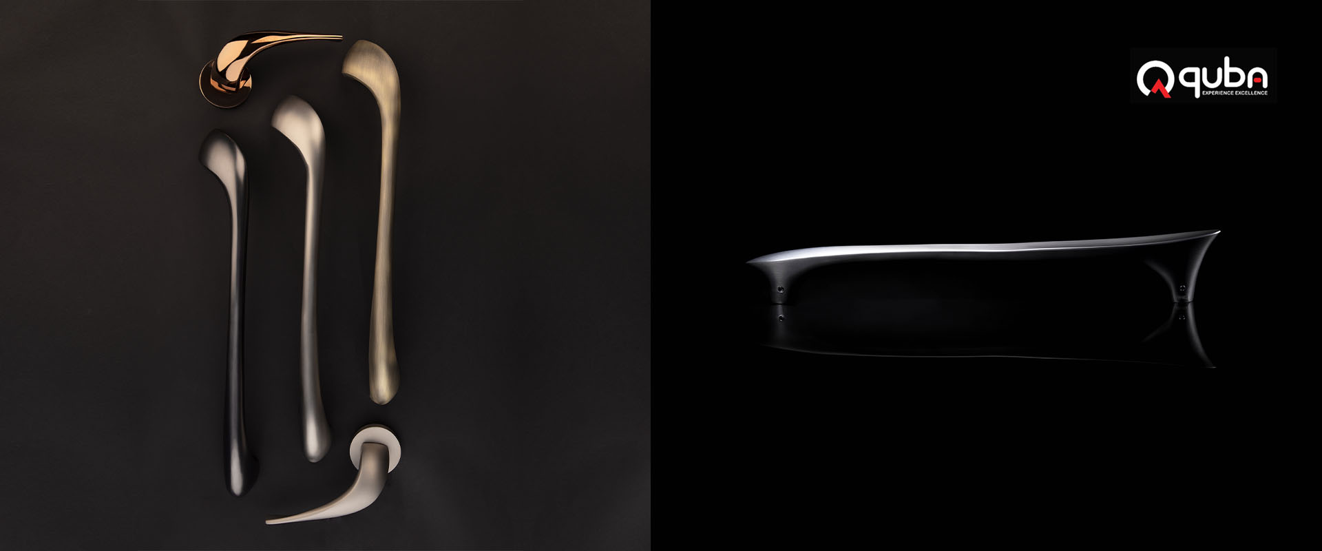
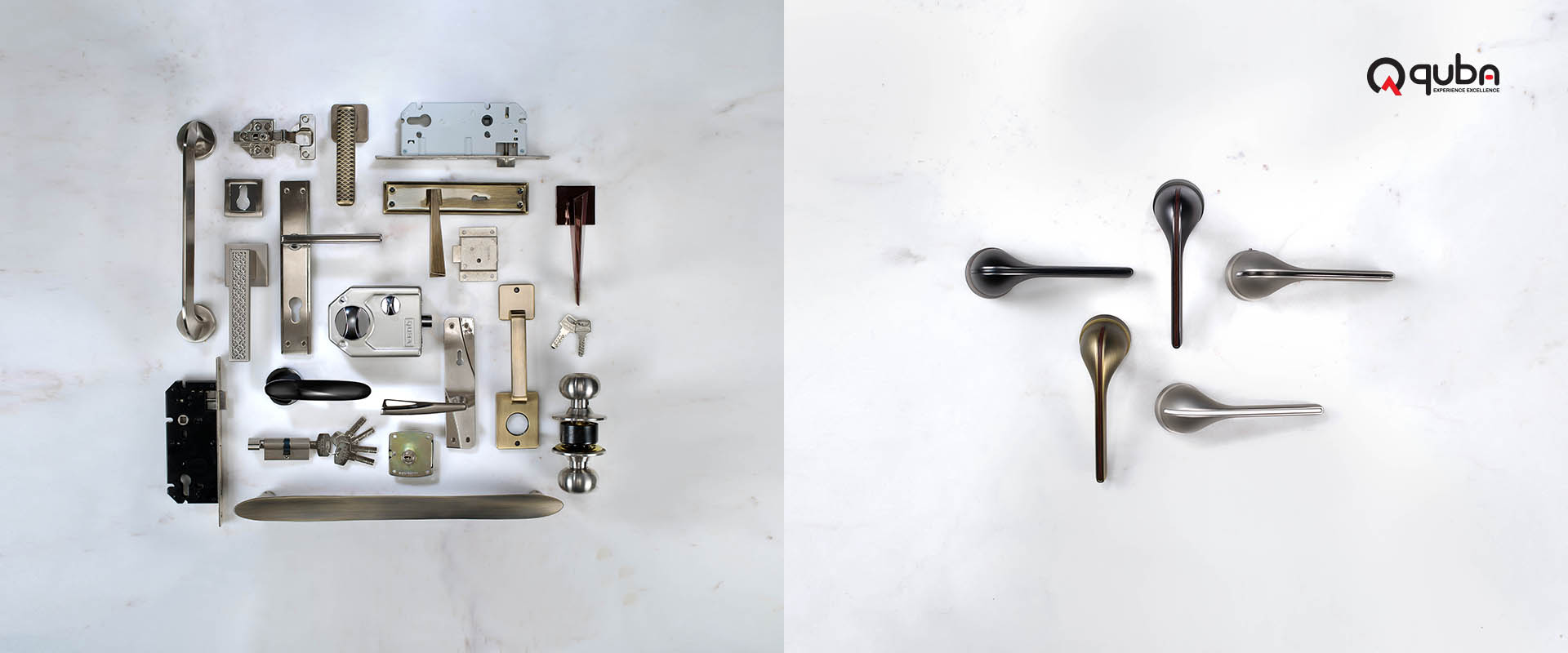
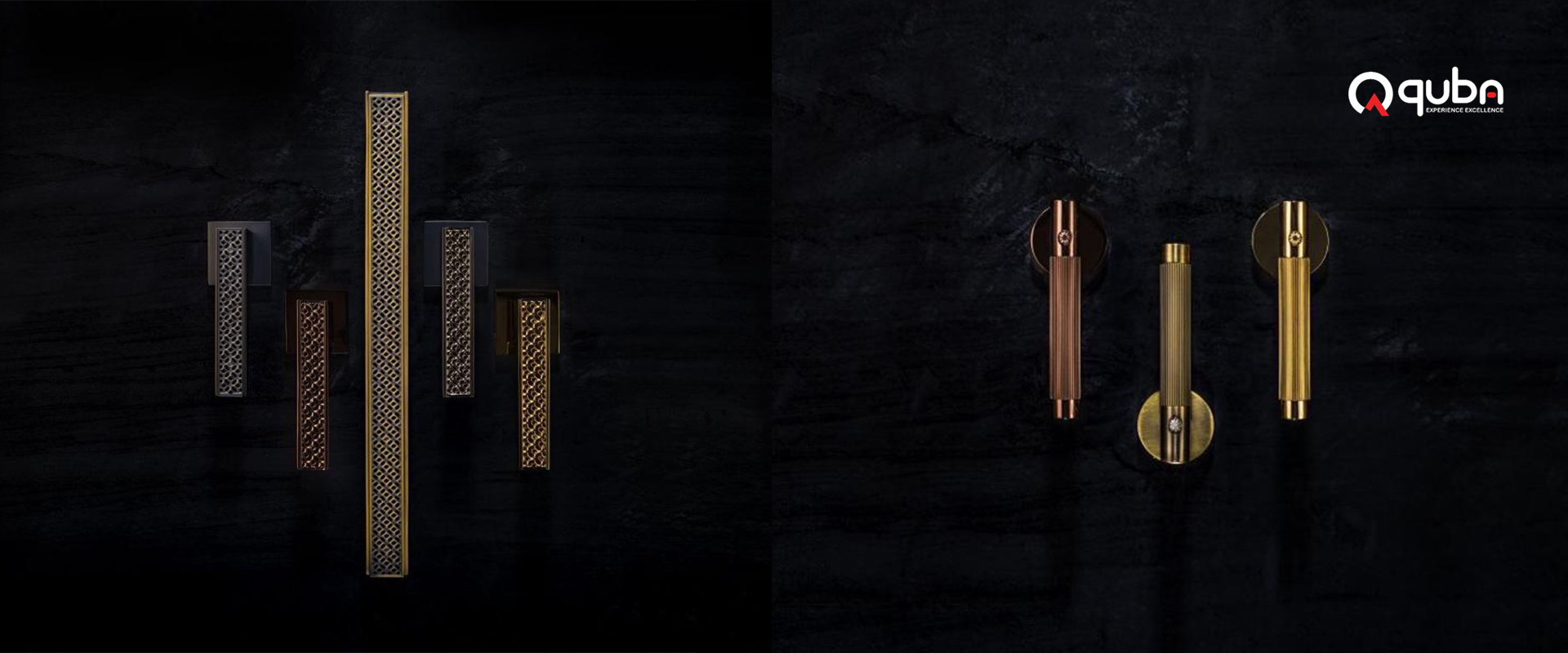
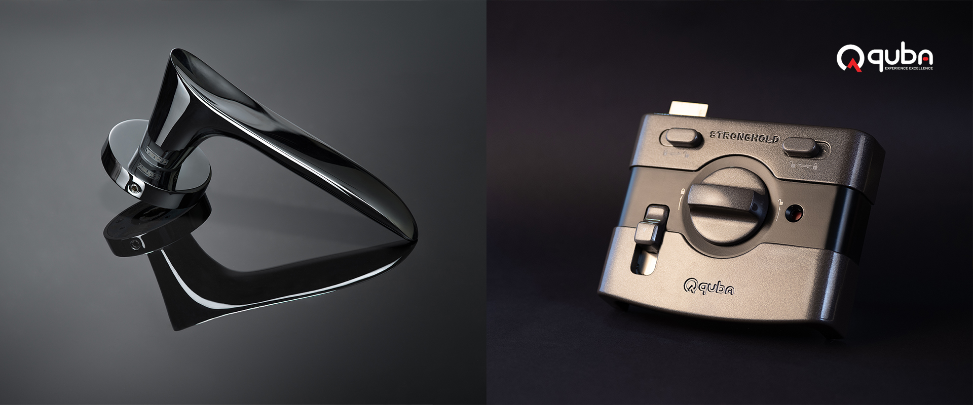
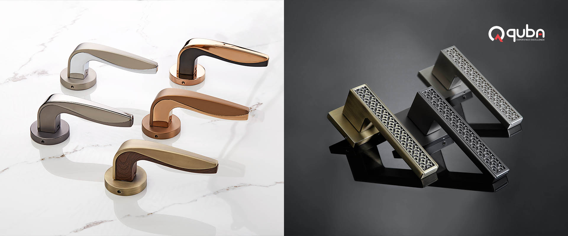
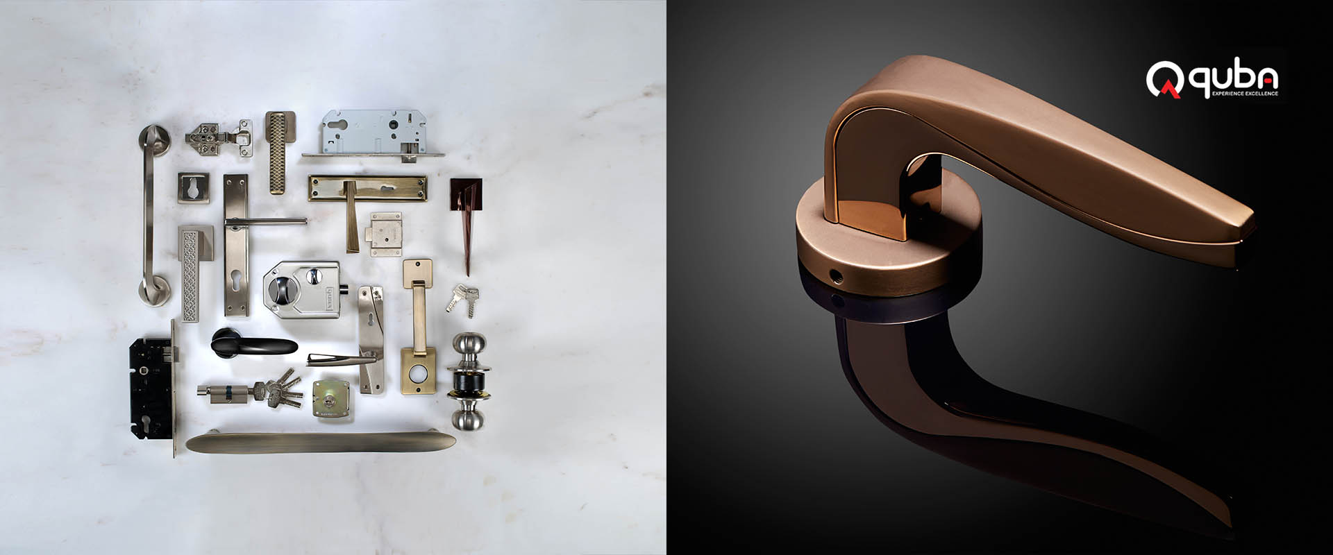
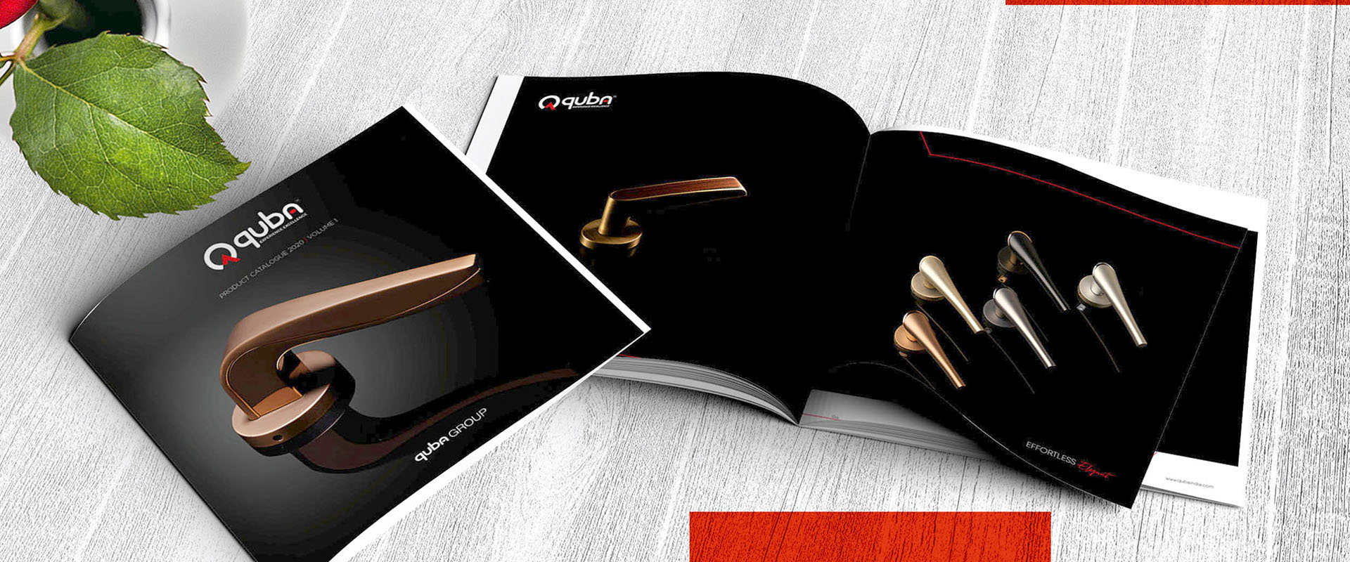
Part of the Quba Group, Quba is a pan India Architectural Hardware brand focused on beautiful handles for doors, locks and digital safes, etc. For Quba, it’s about passion, innovation and authenticity. The brand has been around for decades and has won numerous awards. They were growing, but, not fast enough. So, they connected with us to give them a brand identity and strategy more reflective of their USP. We started with the Quba logo. The brand wanted to position itself as consumer centric and we took their brief as literally as possible. The new Quba logo typeface is constructed by positioning the letter ‘U’ in different ways. A graphic icon depicting the letter ‘Q’ with an arrow pointing upwards to denote constant growth complements this and completes the logo. With a new logo in place, we moved on to revamping their brand strategy, positioning, verbal identity and content strategy. We set Quba apart from the competition by positioning it as a brand that was exclusive and assertive yet focused completely on its partners and consumers. To make sure we were always on the right track, we brought in consultants to look at the Quba sales channels and strategies. Aside from this, we worked on product styling and art direction for product shoots and designed distinctive packaging, display stands and exhibition stalls and outdoor branding. We created new marketing collateral and communication templates that conformed to the new market positioning. Even the brand’s social media posts were given a new look.
