Symmetry
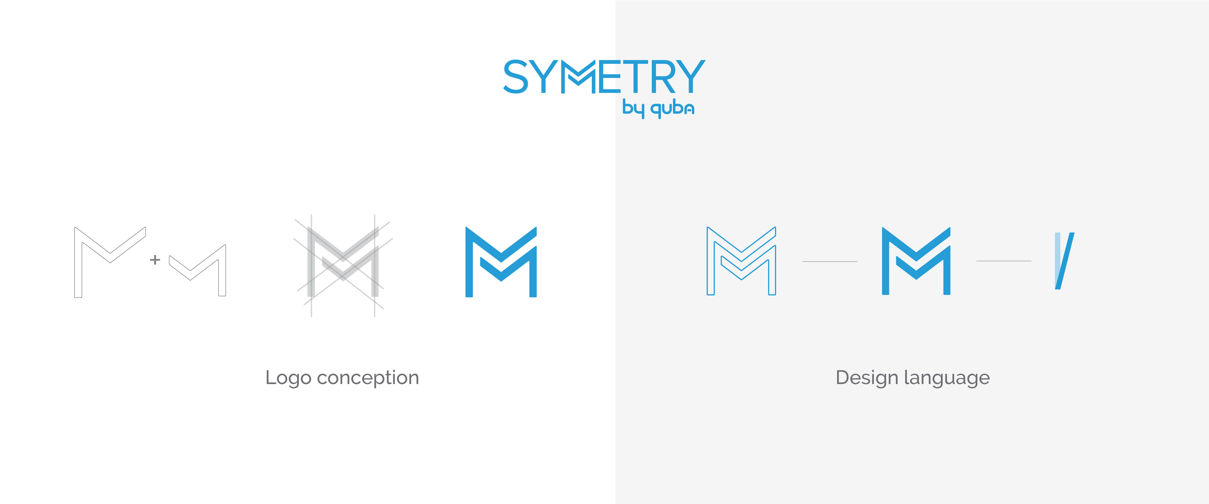
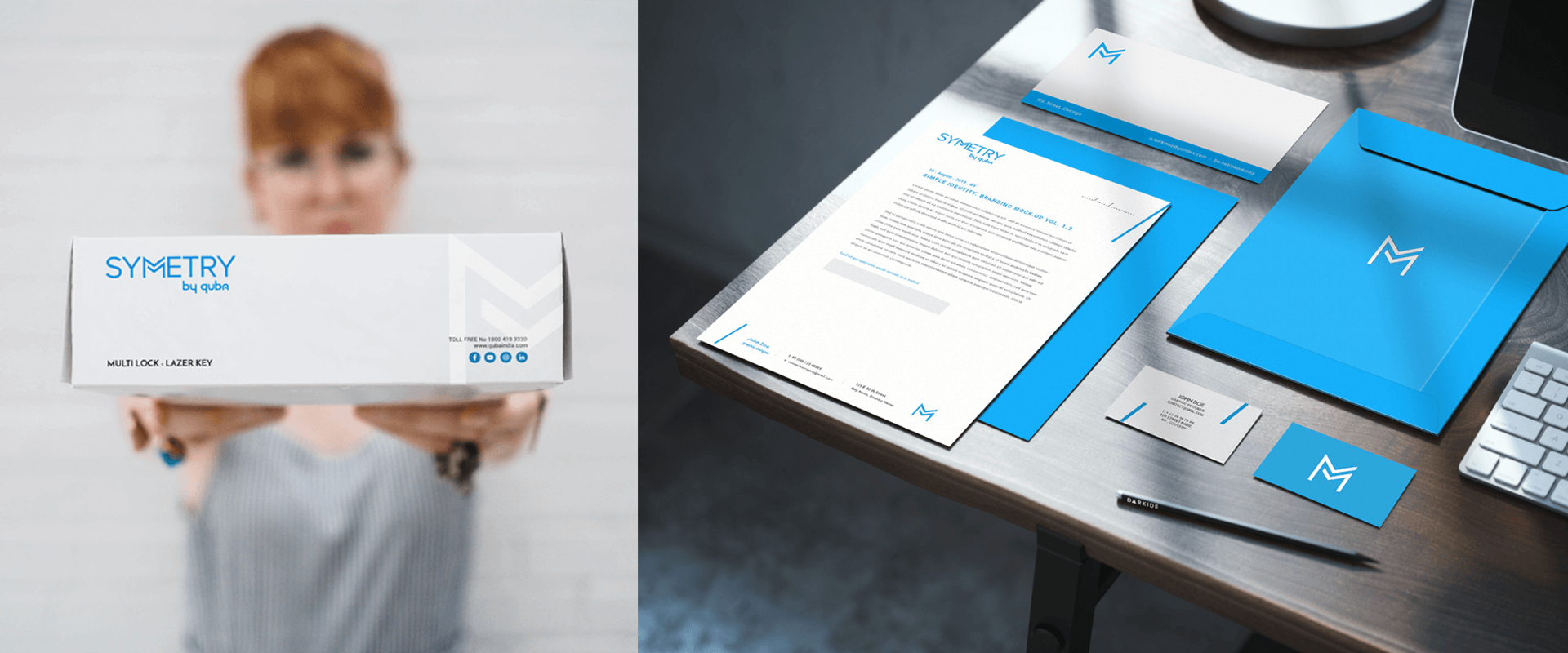
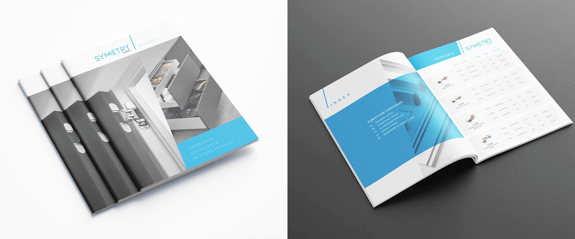
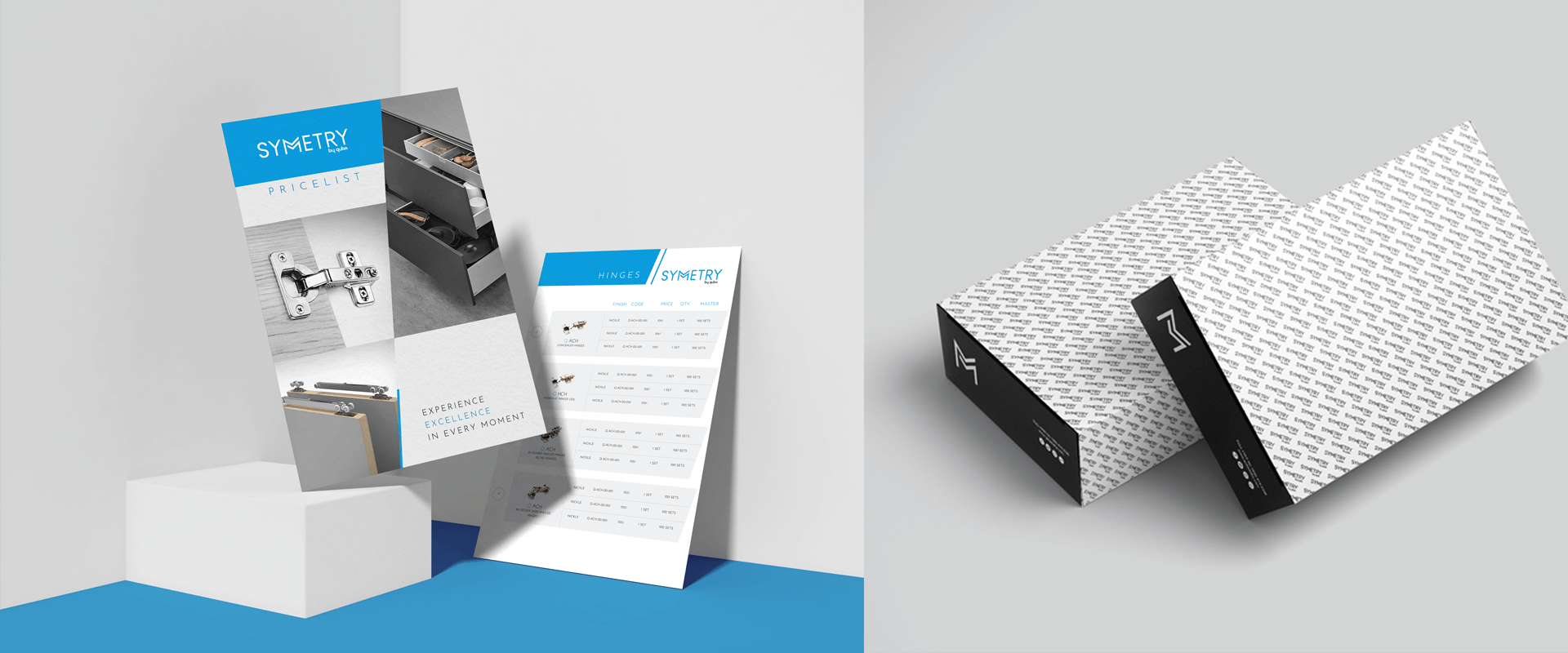
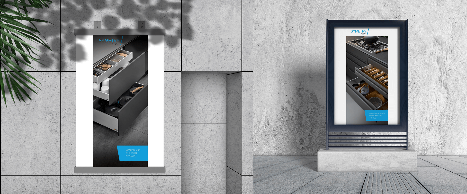
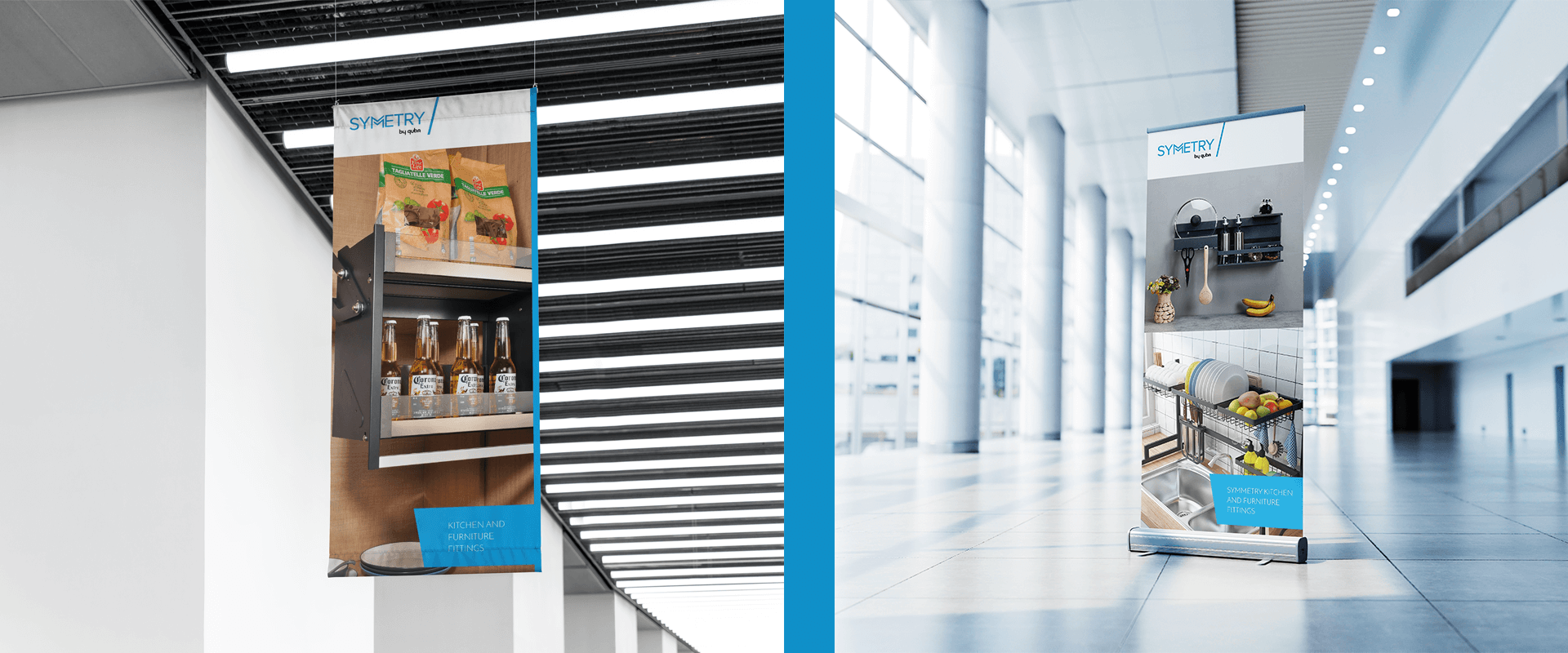
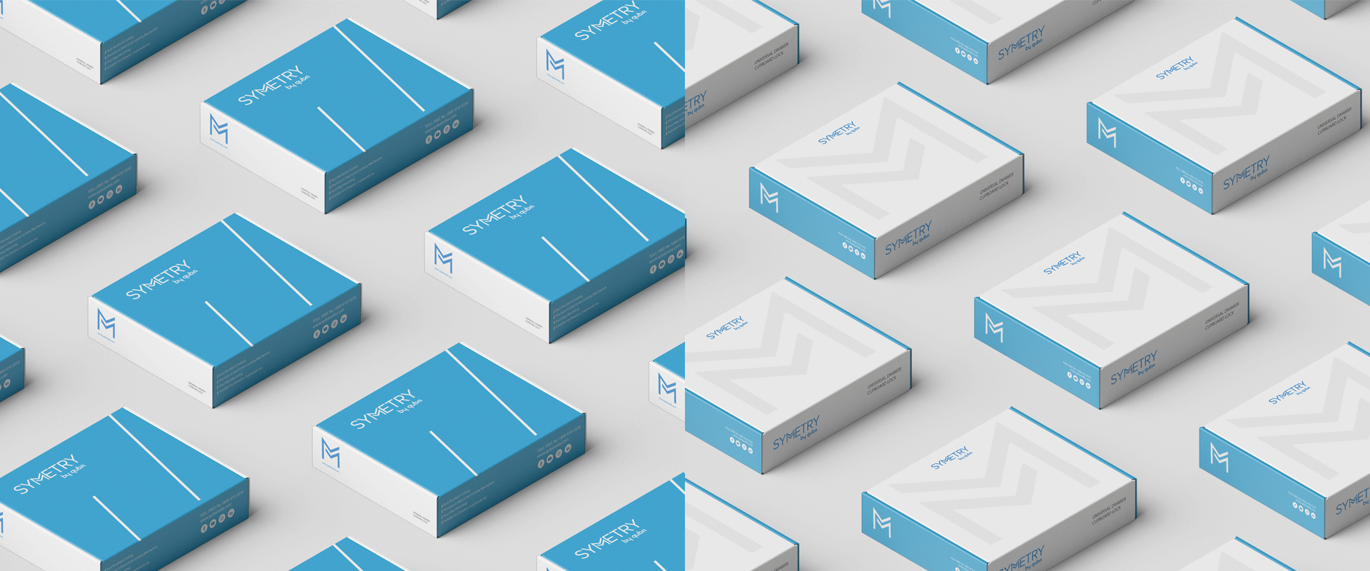
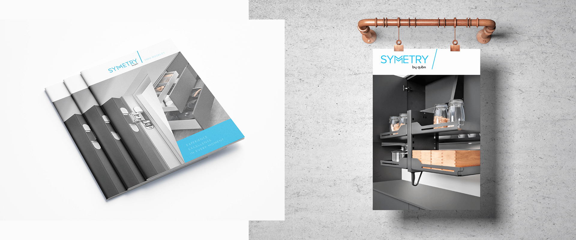
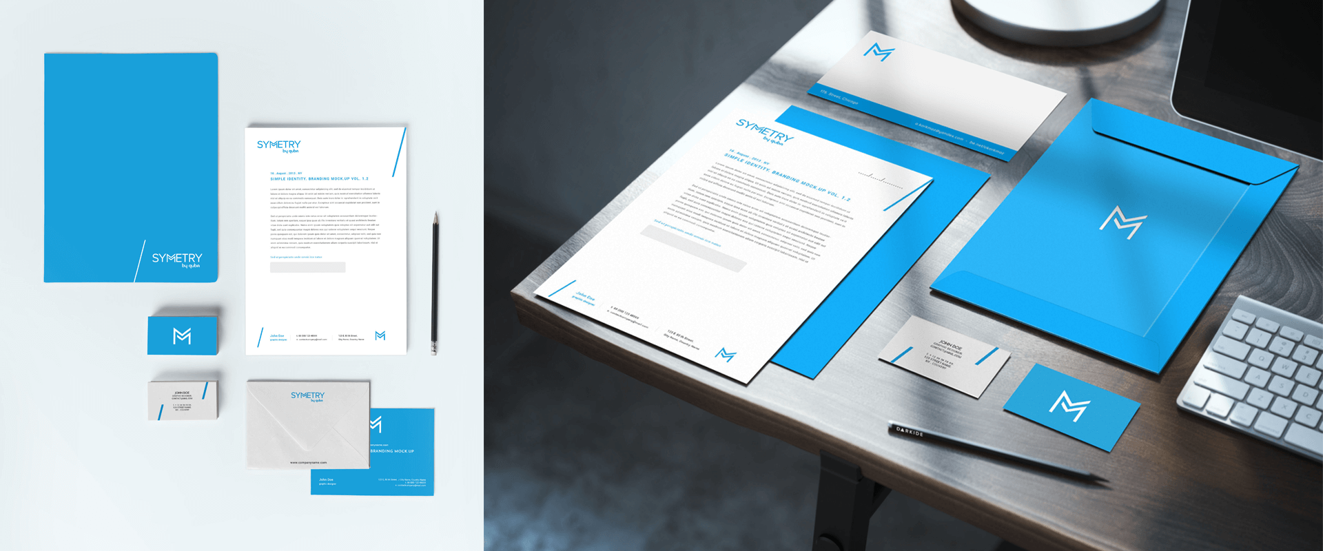
Symmetry is a 'kitchen hardware and furniture fittings' brand by QUBA Group. From shelving units for easy organization to hinges that work behind the scenes, Symmetry has a practical solution for all kitchen hardware needs. Every product is aimed at making life simpler and we needed to design a brand that told this story. Symmetry was our baby from conception to launch. We designed a typographic logo for Symmetry. It kept the brand’s focus on simplicity at its core while reflecting stability and reliability. The overlapping ‘M’ helped shorten the logo and simultaneously became the brand’s symbol. The tilted slash of the ‘M’ was carried forward when we worked on defining the brand language. The logo was step 1. We designed a brand strategy and defined the brand’s market positioning. We set a tone of voice that spoke simply, with warmth and reliability. This laid the foundation for our content strategy and brand expression on outdoor branding and marketing collaterals. And thus, Symmetry became a brand with a unique identity of its own.