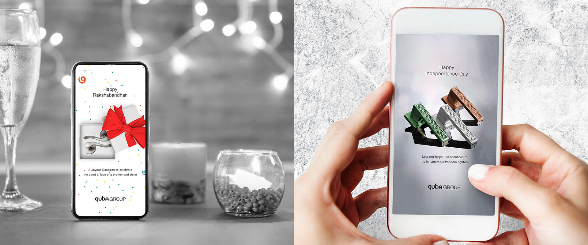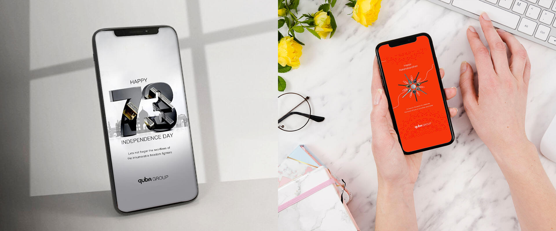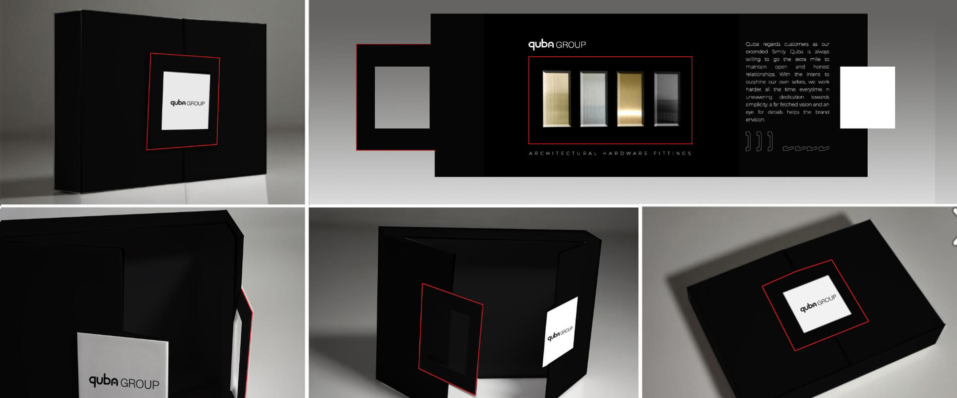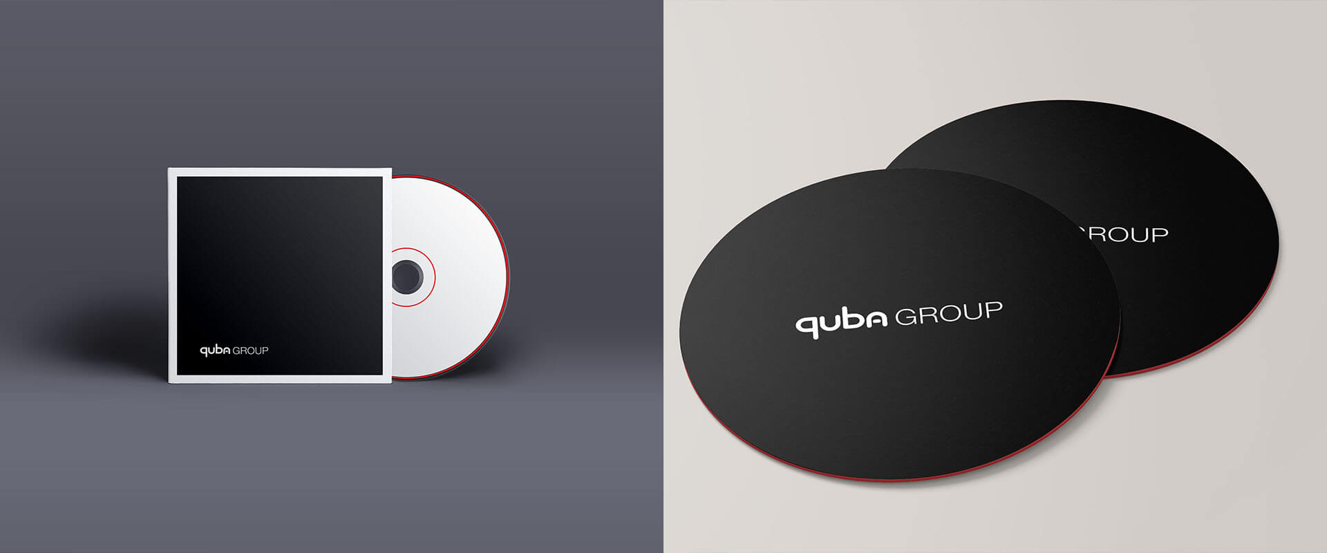
QUBA GROUP
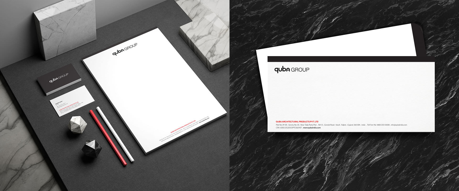
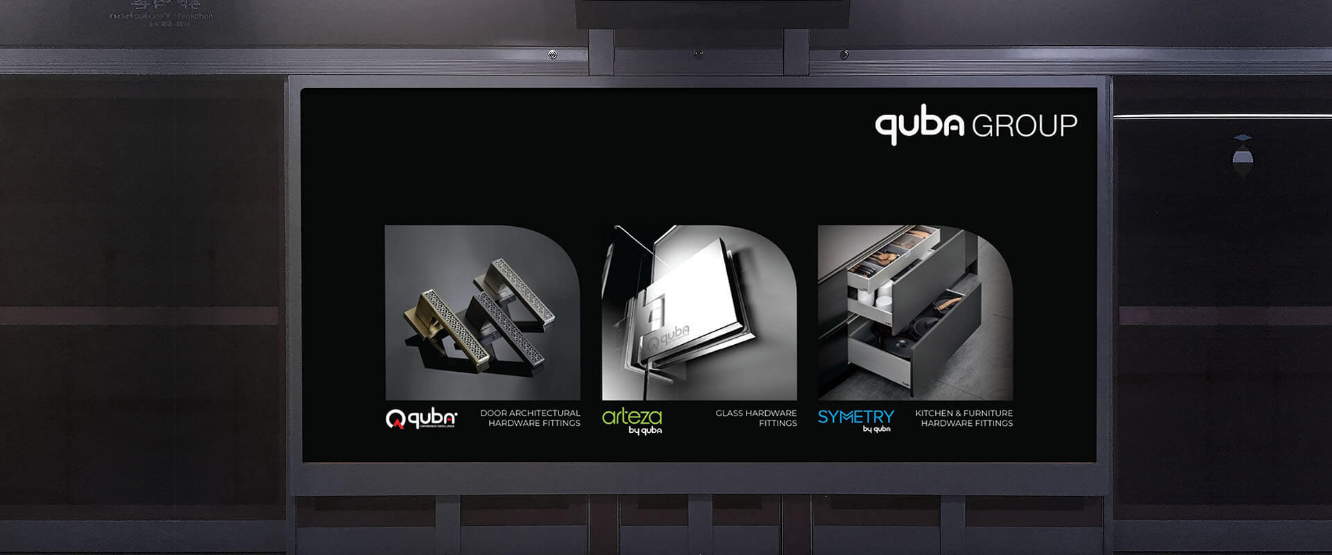
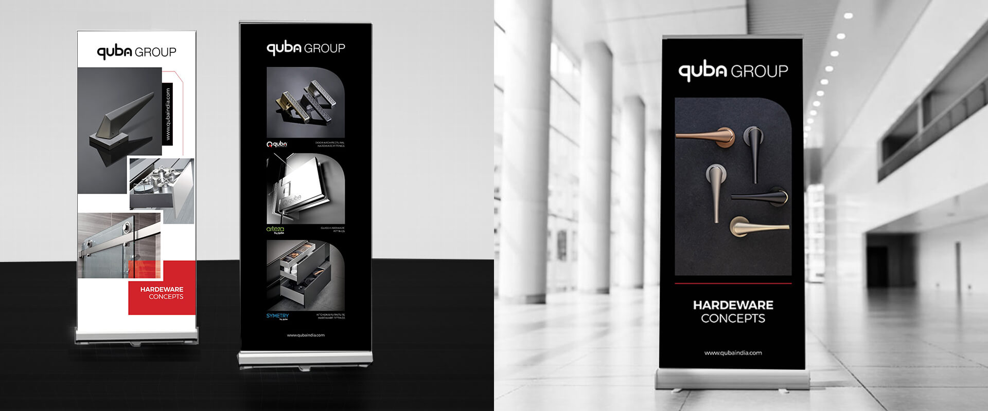
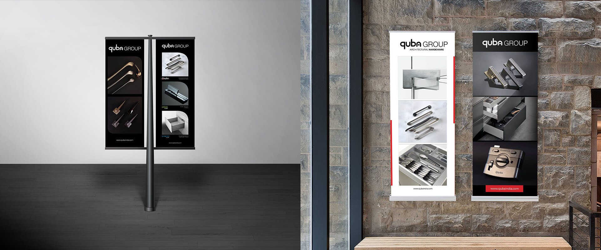
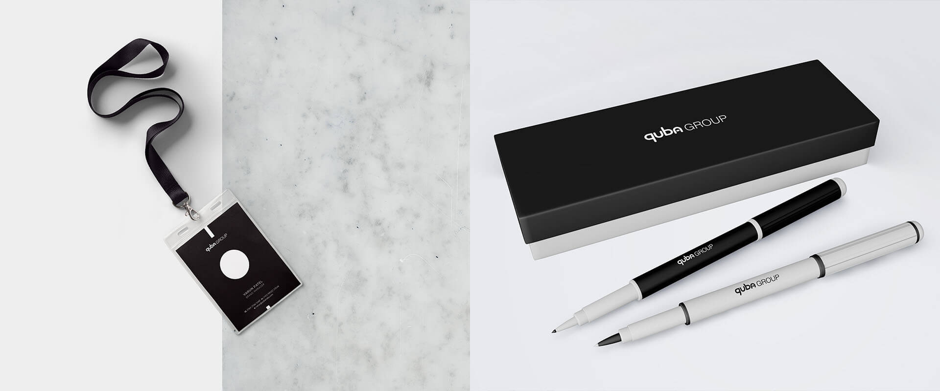
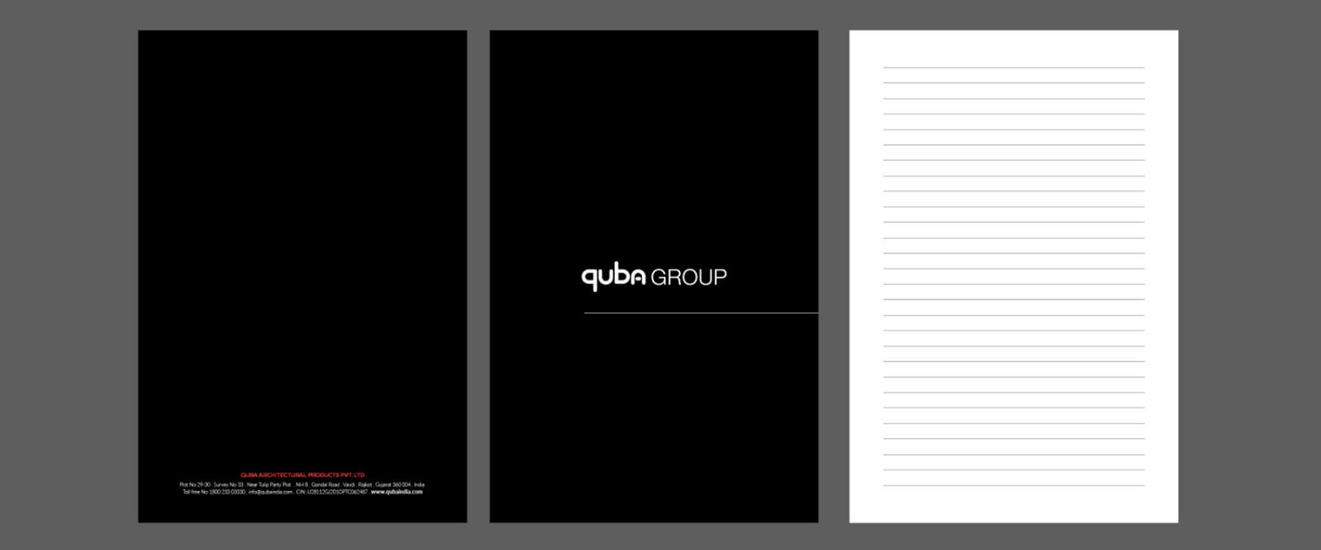
QUBA Group is a design-led manufacturer of quality architectural hardware with three brands – QUBA, Symmetry and Arteza catering to the needs of architects, interior designers, furniture designers and homeowners. The brand emphasizes distinctive aesthetics and needed an exclusive visual identity of its own. We partnered with QUBA Group to create a visual identity not just for the corporate brand but for all three product brands as well. We created an identity that reflected the brand’s focus on its customers by customizing a font wherein all the letters of the name ‘QUBA’ were derived from the letter ‘U’. We paired this with a classic, sans-serif font chosen for its legibility and versatility. The typographic identity is bold and evokes trust & a sense of stability – values that the brand wanted to communicate with its partners. The visual identity was complemented by a verbal identity and content strategy to give a brand a mature tone of voice. We also extended the brand expression to merchandize and marketing collaterals.