Arteza
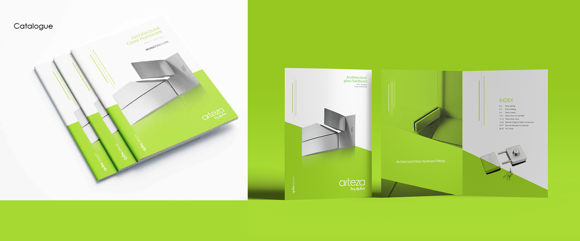
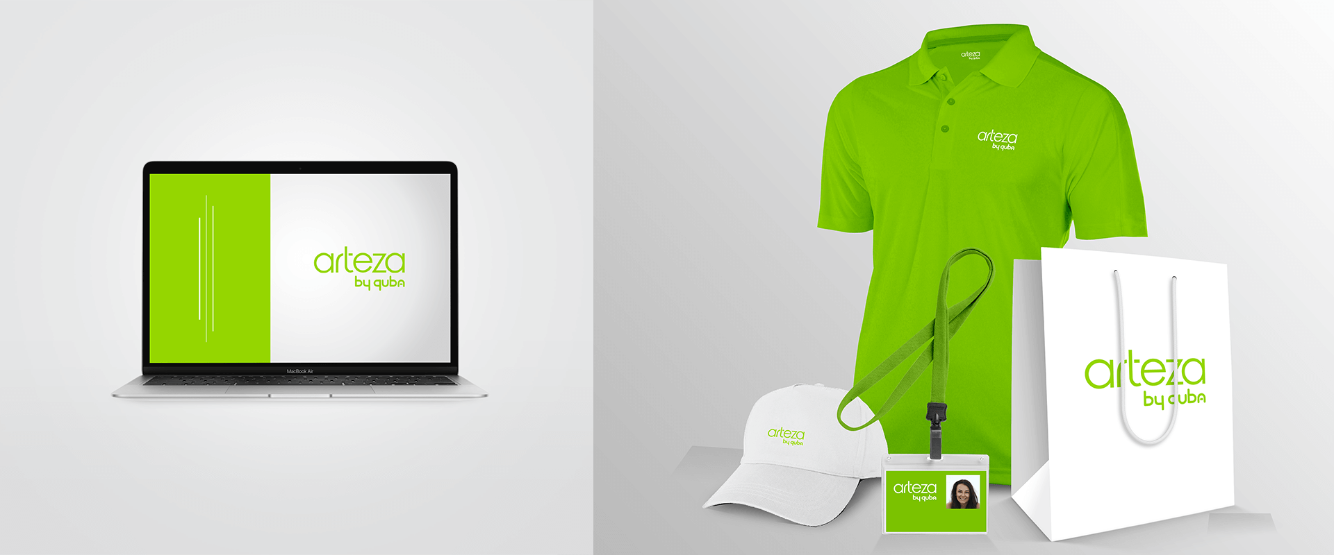
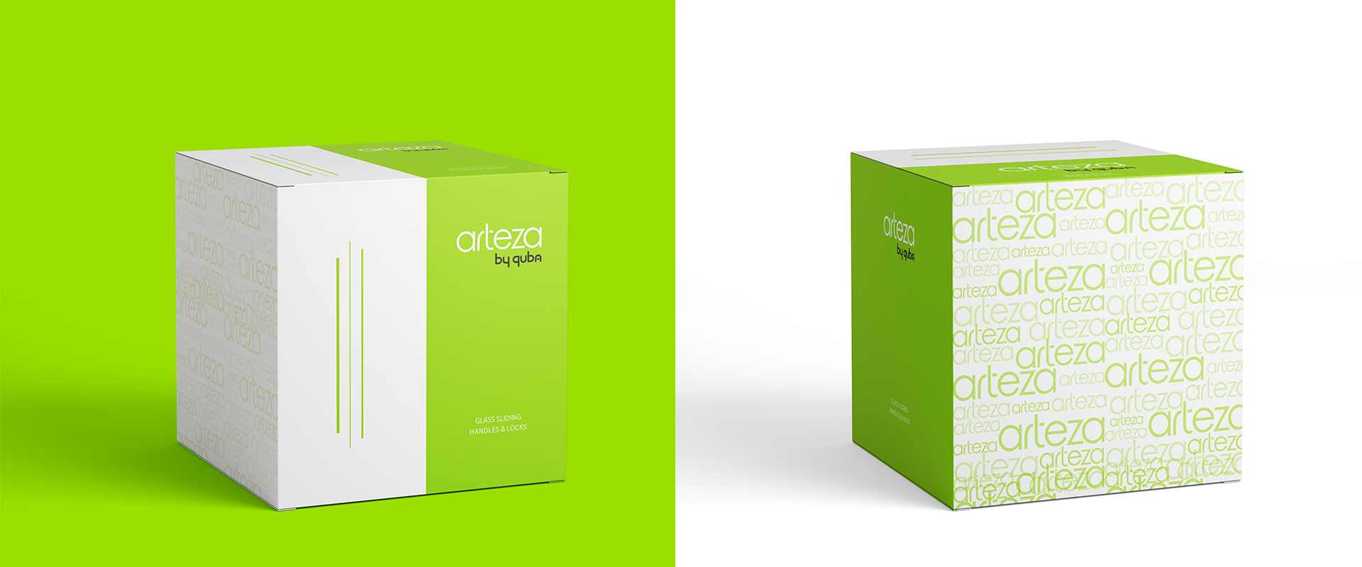
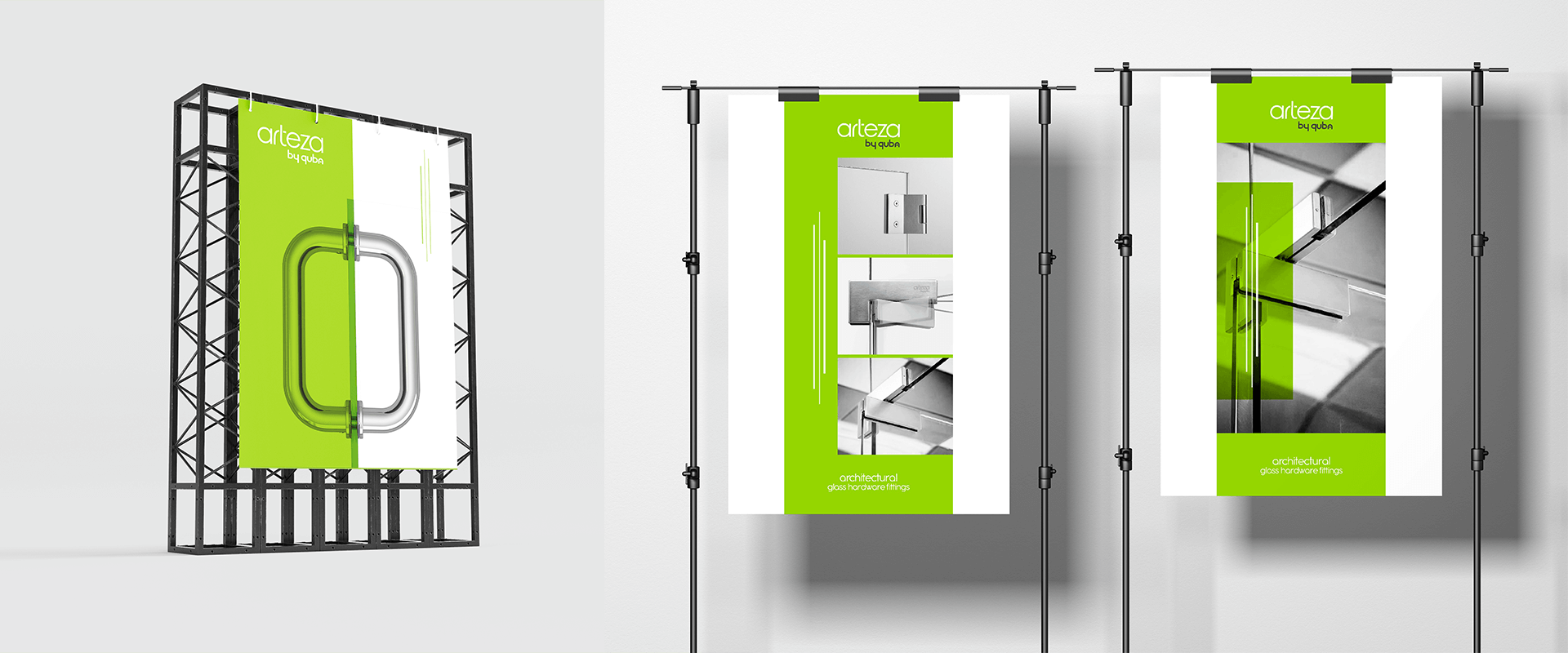
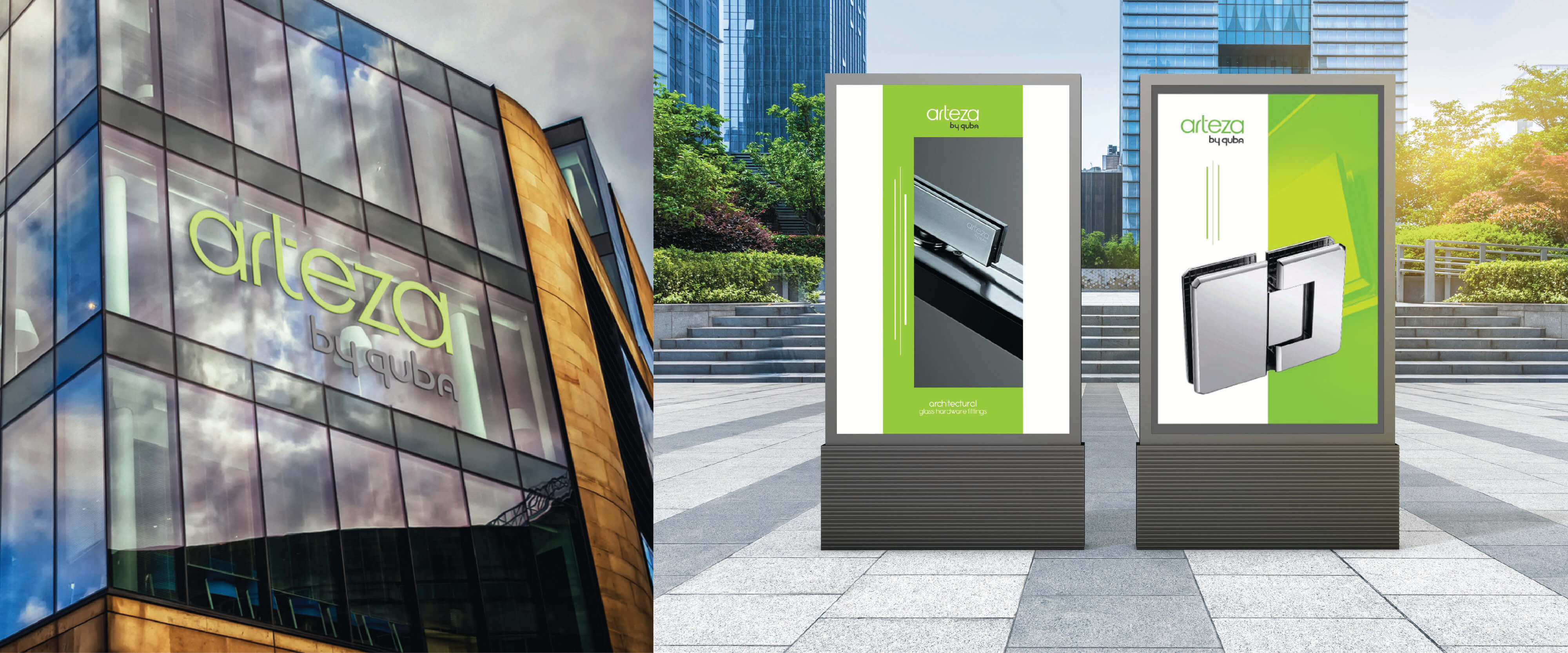
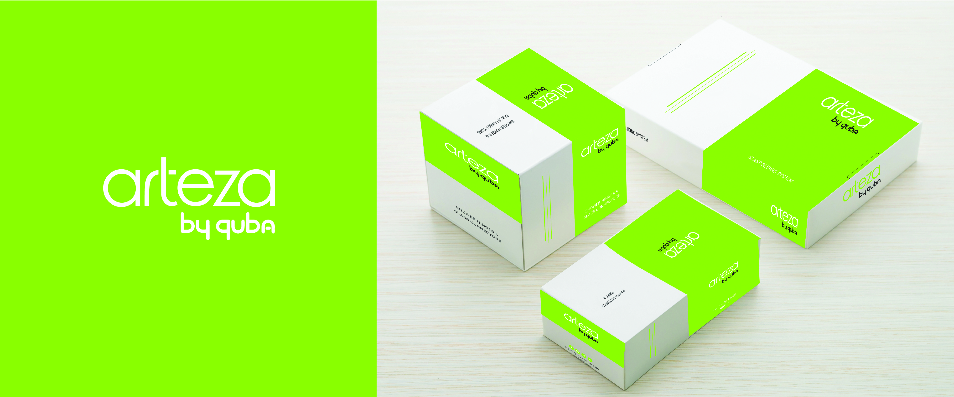
Arteza is a pan-India brand that specializes in architectural glass hardware fittings. Part of the Quba group, every holder, every knob, every hinge… from the Arteza product range is the result of precise engineering and compromise-free quality controls. When it came to developing a brand identity for Arteza, these were qualities we knew we had to accentuate. We created a logo that mirrors the visual simplicity of Arteza products but is symbolic of the brand’s core qualities. The symbol is inspired by the varying thickness of glass sheets and the technical detailing that goes into every product. We defined a colour story inspired by the colour of glass panes after a thorough online competitive analysis and target audience study. The competed visual identity was everything Arteza stands for – precise, dependable and robust. To complement the logo, we defined a visual brand expression and content strategy. The brand now had a look that matched the quality of its products.