Harbour Fresh
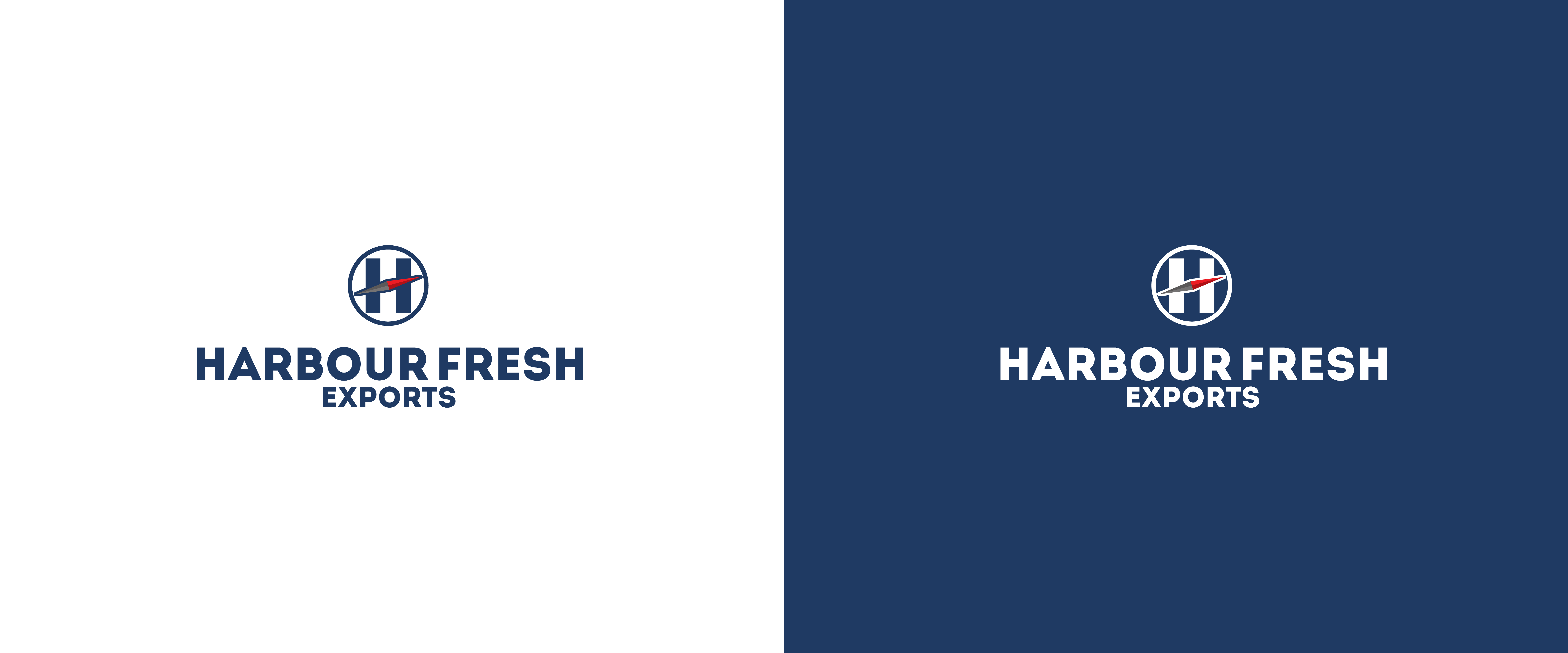
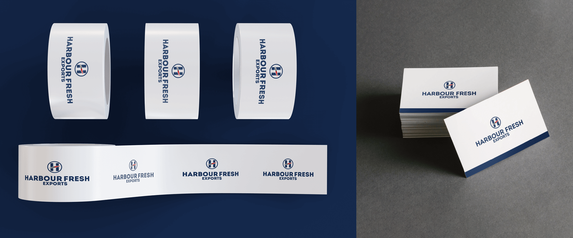
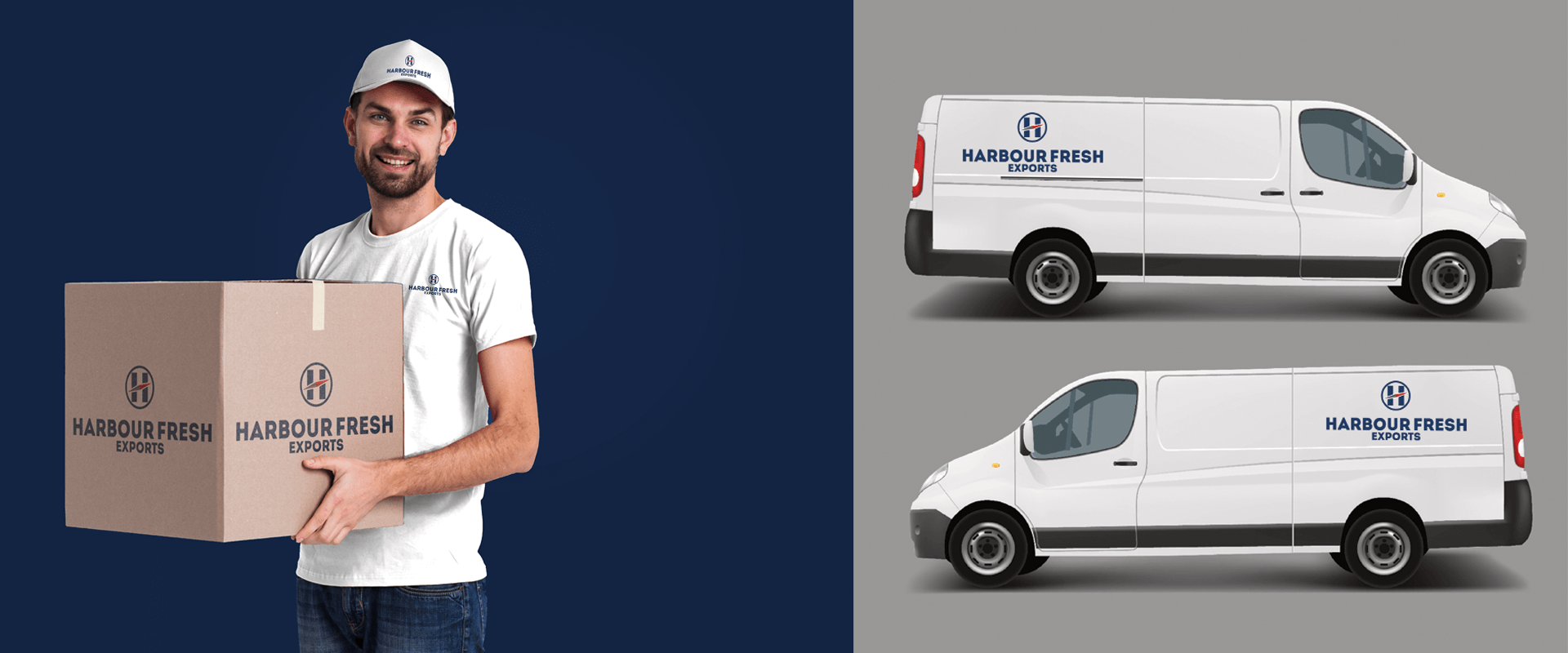
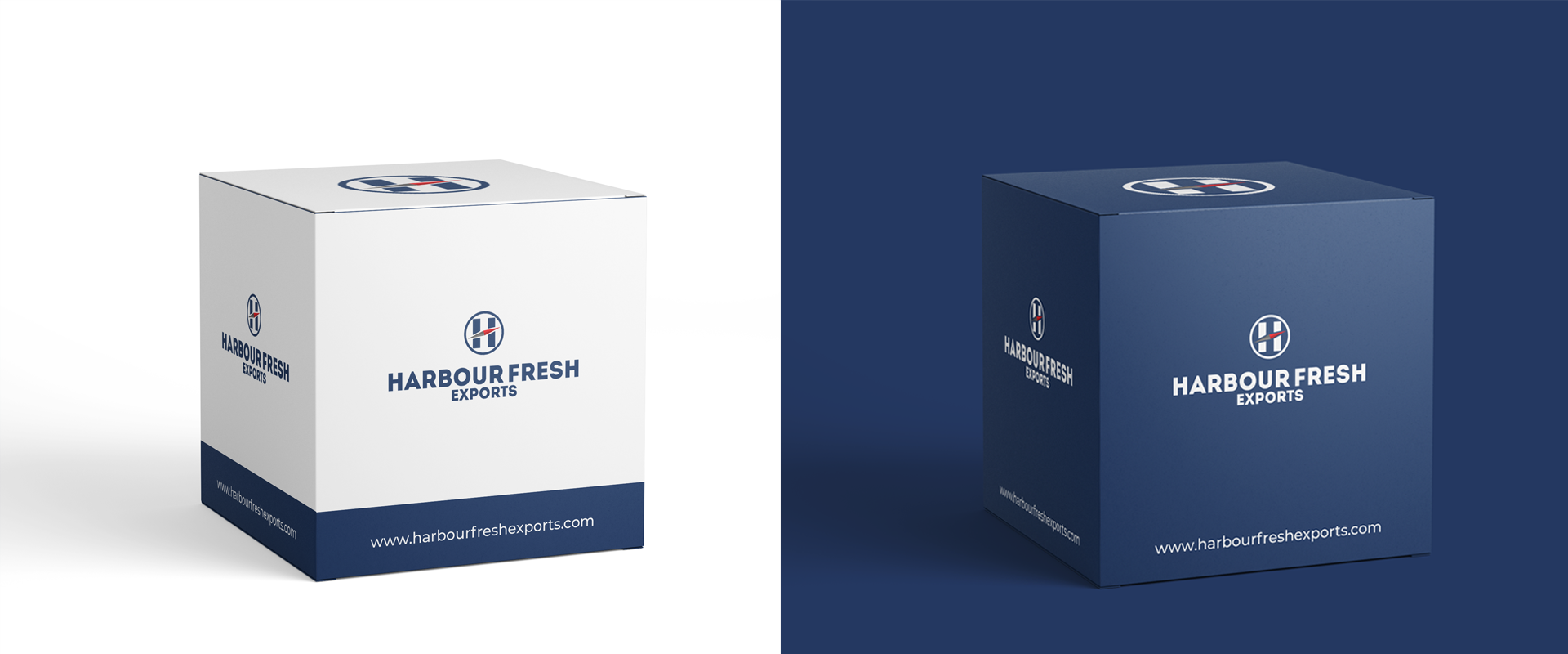
Harbour Fresh is an Indian-run company specializing in the export of perishable foods and other commodities. We approached their branding with the aim of creating a bold visual language that would reflect its corporate nature and yet be easily identifiable and memorable for transporters. We designed the Harbour Fresh logo around a compass that symbolized the nature of their business and the company initial. The colour story too drew inspiration from their line of work. We chose a cool, calm blue and pristine white to maintain the corporate look and feel and yet stay true to the name (can you imagine a harbour that isn’t blue…). Minimal, fresh and reliable – the brand identity was a true symbol of the company’s essence. We didn’t stop here. We extended the brand identity to marketing collateral, packaging, uniforms and decals – areas where none of their competitors had ever thought of making their presence noted.

